
Wall texture design covers everything from peel-and-stick rolls you can hang in an afternoon to professional-grade Venetian plaster that needs time between coats and a steel trowel to finish.
The deciding factor is how permanent your situation is: renters lean toward paint effects and removable papers, while owners can commit to stucco, concrete overlays, or anchored wood slats that ask for stud placement and cure time.
Kitchen concrete texture walls need a base coat, texture coat, and seal, each with its own dry stage; skip one and the surface fails.
[link-whisper-related-posts]1. Textured Paint Wall Texture Design
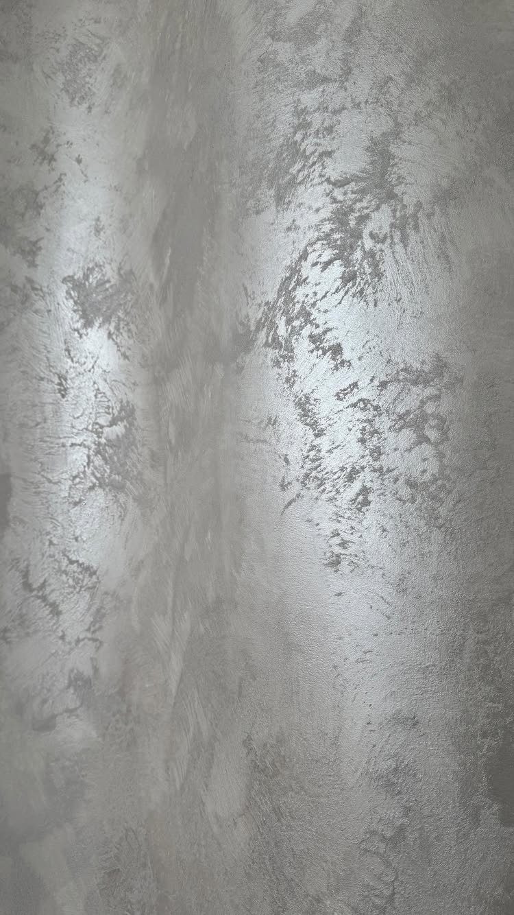
Textured paint lets you build the surface itself into the design rather than laying something over it. Swirling patterns, metallic sheens, or skip-trowel effects all come from how you move the material, not from what you hang.
I like this for renters who cannot add permanent structure; a painted texture reads as finish, not fixture, and usually clears a landlord check. Eggshell to high-gloss topcoats shift how the light plays without changing the relief underneath.
Practice on a board first; the motion is simple but the timing is not. For kitchens or open living areas, match the sheen level to how much wiping the wall will need.
“Textured paint is ideal for rooms where you want the walls to tell a story,” says Lisa Rickert, cofounder and principal designer at Jolie Home.

Bates paint roller kit includes 19 essential pieces for home painting, prep, and cleanup projects.

13 Pieces Painting Set: The small paint roller kit includes a 4 inch paint roller frame, a 4 inch red paint tray, paint tray liners 3 pcs, 4 inch microfiber paint roller covers 6 pcs, a 1.5 inch angled paint brush and a piece of drop cloth. Equipped with everything you need to complete any paint job with ease

Paint Roller kit 10 Pack: 2 inch foam paint roller covers 6 pack, 2 inch plastic paint tray, 2 inch paint tray liners 2 pack, small paint roller frame
2. Knockdown Texture
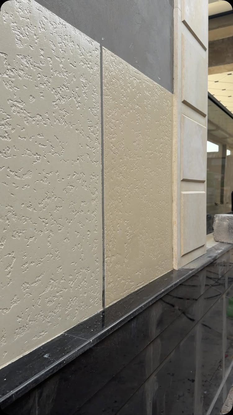
Knockdown texture lands between flat and rough: spray a joint compound, let it set slightly, then flatten the peaks with a wide knife. What remains is a mottled surface with soft edges that catches light without shouting.
Living rooms and hallways suit it best, places where you want depth but not drama. Side lighting across the texture hides small wall flaws that a flat finish would spotlight; matte or eggshell paint keeps the understated look intact.
Cleaning means dusting with a soft brush vacuum attachment or spot-wiping with mild detergent. The texture is low-maintenance once up, though deep scuffs need touch-up rather than scrubbing.

Easy wall texture spray - convenient aerosol application for knockdown or "southwest" drywall repair

Wall textured spray features DAP Aim Tech adjustable nozzle that easily rotates upwards to spray at almost any angle for maximum coverage and pro results in creating wall texture and ceiling texture on drywall, stucco and plaster

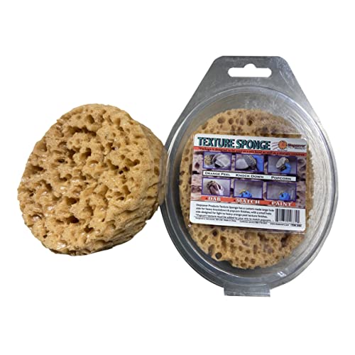
Function: the knockdown sponge is intended for small repairs and areas that need textured, which blends well with original texture. Note: The sponge is vacuum-packed. Please wet the sponge to expand it upon receiving the sponge
3. Orange Peel
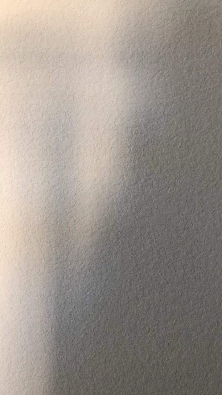
Orange peel gets its name honestly: a fine, dimpled surface that reads like citrus skin under light. A thinned compound goes on by sprayer, dries slightly, then takes paint over top.
Ceilings are where I have seen this most, though it works on general wall surfaces too. The scale is small enough for compact rooms where heavier textures would close in; it gives modern interiors texture without pattern.
Maintenance is straightforward. Vacuum with a soft brush, wipe stains with mild soap and water, avoid abrasives.
The surface holds up to normal living but will not take aggressive scrubbing.

Low odor, easy clean up water-based orange peel aerosol wall texture

Convenient aerosol application for textured orange peel or splatter drywall repair with dry time indicator

Adjusts to spray fine to heavy orange peel textures
4. Stucco Texture
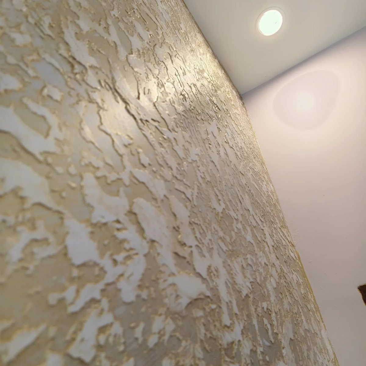
Stucco carries the weight of old plaster walls and Mediterranean courtyards. Thick cement-based layers go up, then a trowel or sponge breaks the surface into rough, uneven relief that reads as stone rather than paint.
Entryways and exteriors suit this best, places where the texture meets the eye at a threshold. Inside, it needs rustic or earthy surroundings to feel at home; drop it into a sleek modern room and it fights everything around it.
Once it is on, it stays on. This is not a weekend paint job; the material is heavy, the cure time is real, and changing your mind means significant removal.
Check your wall structure and local climate before committing, especially outside.

Red Brick Wallpaper - PRODUCT SIZE and Color, 17.5 Inch Wide, 118 Inch Long, one roll cover 1.32 Square meters, red birck, please buy enough for one time according to your wall size. The product has variants of color and size, please read the product details carefully to avoid purchasing the wrong color of the product.

Authentic Distressed Look Design : The realistic appearance and gray-white tone of white wooden wallpaper,showcases a wood texture with natural imperfections,that captures the timeless beauty weathered wooden planks

PRODUCT DETAILS – Dimensions: 17.7in×118in / Roll (14.5 Square Feet / Roll) black wood wallpaper. Material: Vinyl / PVC black wood peel and stick wallpaper. Material thickness: Our black wood wallpaper is made of heavy-duty vinyl (0.15mm thick). Adhesive & Packaging: Features repositionable adhesive with no residue, and reinforced protective packaging to minimize transportation damage
5. Geometric Wall Texture
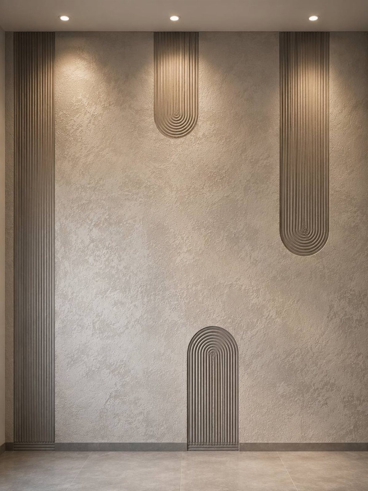
Geometric relief turns the wall itself into sculpture: vertical flutes, arched channels, or repeated shapes built into plaster that catch light like architectural detail. Stencils help, but the effect comes from physical depth, not printed pattern.
Minimal spaces benefit most, rooms where the furniture is quiet and the wall needs to carry interest. The risk is overbuilding; one feature wall is usually enough, and the rest of the room should stay clean to let it read.
Without directed light the texture flattens and you lose half the effect. Plan your lighting before you plan your shapes.

Flexible & Precision Polished: Made of polished stainless steel with a 0.3mm thickness, offering the ideal balance of flexibility and control for ultra-smooth Venetian plaster finishes.

4-Piece Trowel Set: This plaster trowel set includes 4 sizes: double round-head, rounded-corner, and polygonal types for various tasks. From large wall leveling to fine edge finishing, this multi-size wall trowel and multi-size trowel set handles it all. Suitable for putty, cement, Venetian plaster, and wall repairs – a complete construction plastering tool kit for professionals and DIYers.
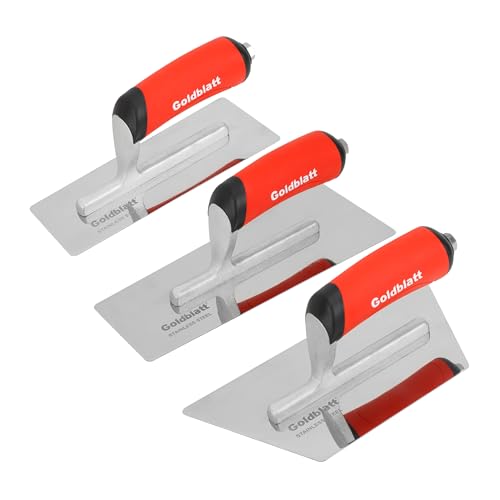
Beveled & Trapezoid Blade for Premium Finish: The working edge of the blade is beveled to prevent aggregate popping. Trapezoid design provides greater surface coverage and control compared to a traditional rectangular blade. Each concrete trowel features a 0.03 inch (0.7 mm) thick blade, always ensures good performance after repeated use
6. Wood Texture Finish
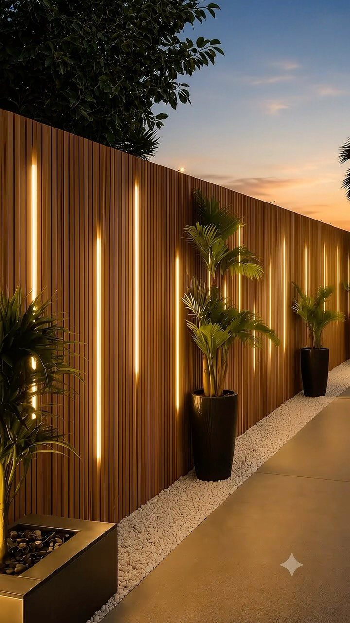
Wood slats or grain panels bring warmth that paint rarely matches.
Vertical boards with integrated lighting work inside too: behind a headboard, along a hallway, or as a partial feature wall that stops at ceiling height rather than wrapping the room.
Bedrooms are the natural home for this. The material reads cozy, and the vertical lines draw the eye up without adding clutter.
Painted wood paneling is an option if natural tone feels too heavy for your light levels.
Check your wall structure before installing; slats need anchoring, and stud placement changes where the seams fall. LED strips need channels routed or surface-mounted, and both choices show in the final look.

COMPLETE 12-PC PROFESSIONAL SET:Includes 4" tray ×1, snap-fit handle ×1, reusable liners ×2, liner cover ×1, dual-brown microfiber sleeves ×4, white microfiber sleeves ×2, and 1.5" angled brush ×1. Perfect for walls, ceilings, trim, cabinets, and furniture

Complete 4" Mini Paint Roller Kit: This all-in-one professional painting kit includes (5) high-density foam roller covers, a sturdy 4-inch roller frame, a deep-load paint tray, and a disposable tray liner. Perfect for small projects and touch-ups, it saves you time and money—no need to buy components separately

Textured Paint Rollers: perfect for applying textured paint or coatings, coarse aggregates, epoxy or floor finishes, Whether you're tiding up an old room or working on a DIY project, this paint roller is flexible enough in 3 quantities to meet your needs
7. Brick Texture Wall
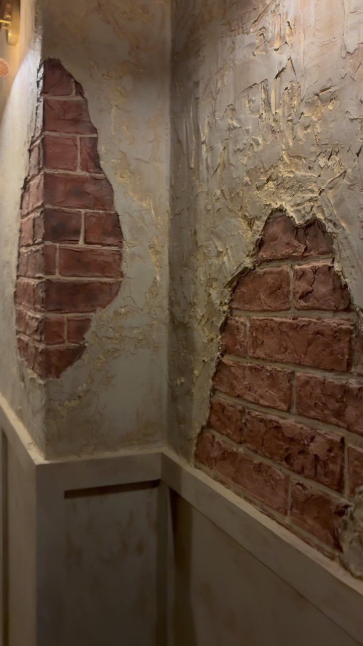
Brick textures give you the industrial feel of exposed masonry without rebuilding your wall. Joint compound and paint fake the look without the weight or cost of real brick, and the job finishes in a weekend.
Real brick veneer costs more and needs structural consideration, but the faux route works for renters or anyone testing whether they actually want to live with the aesthetic.
I’d point this toward a dining backdrop or TV wall where you want visual weight without clutter. The texture catches light unevenly, so plan your lighting placement before you commit.
One risk: in a small room, the busy pattern can close the space. In a small room, keep it to one accent wall so the texture stays interesting instead of overwhelming.

Wall textured spray features a grip trigger for full hand control and works for quick targeted repairs including fixture removal, small holes, and other minor texture repair

Pirate Patch is fast and easy (only 6 steps)
8. Floral Pattern Texture
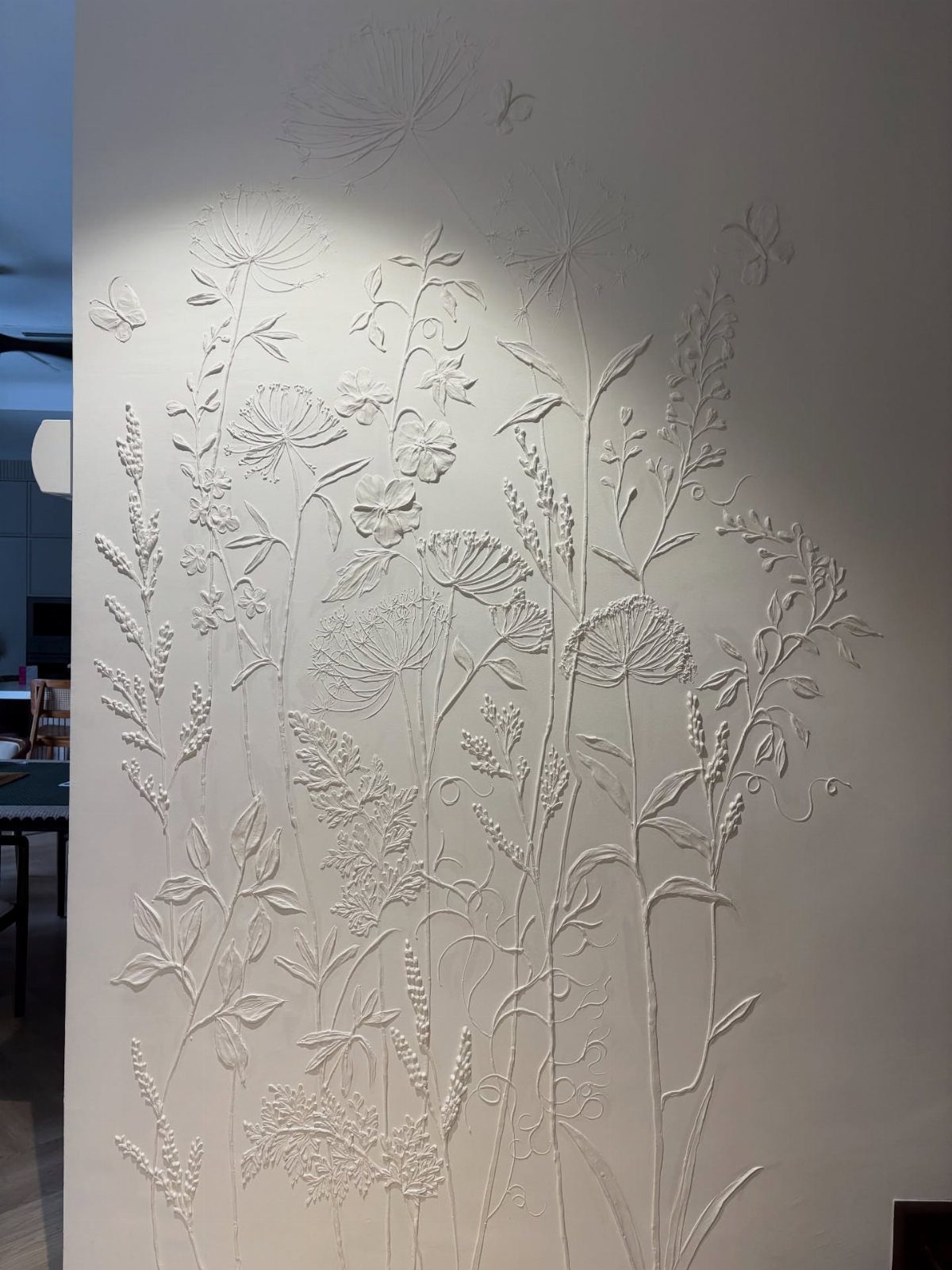
A raised floral relief reads as sculpture rather than wallpaper, which makes it suited to a bedroom wall you face on waking rather than one you walk past.
Plaster or joint compound builds the forms, with silicone molds now widely available for repeat elements like petals and stems.
Subtlety matters more than ambition here. Deep relief gathers dust in the crevices and can read as chaotic under daily light.

Note: To attain optimal pressure levels for successful application of the product Shake CAN upside-down vigorously for one full minute before using and continuously during use.Also, try soaking the can in warm water for 15 to 20 minutes

Dries in 5 minutes or less

Wall textured spray features DAP Aim Tech adjustable nozzle that easily rotates upwards to spray at almost any angle for maximum coverage and pro results in creating wall texture and ceiling texture on drywall, stucco and plaster
9. Venetian Plaster
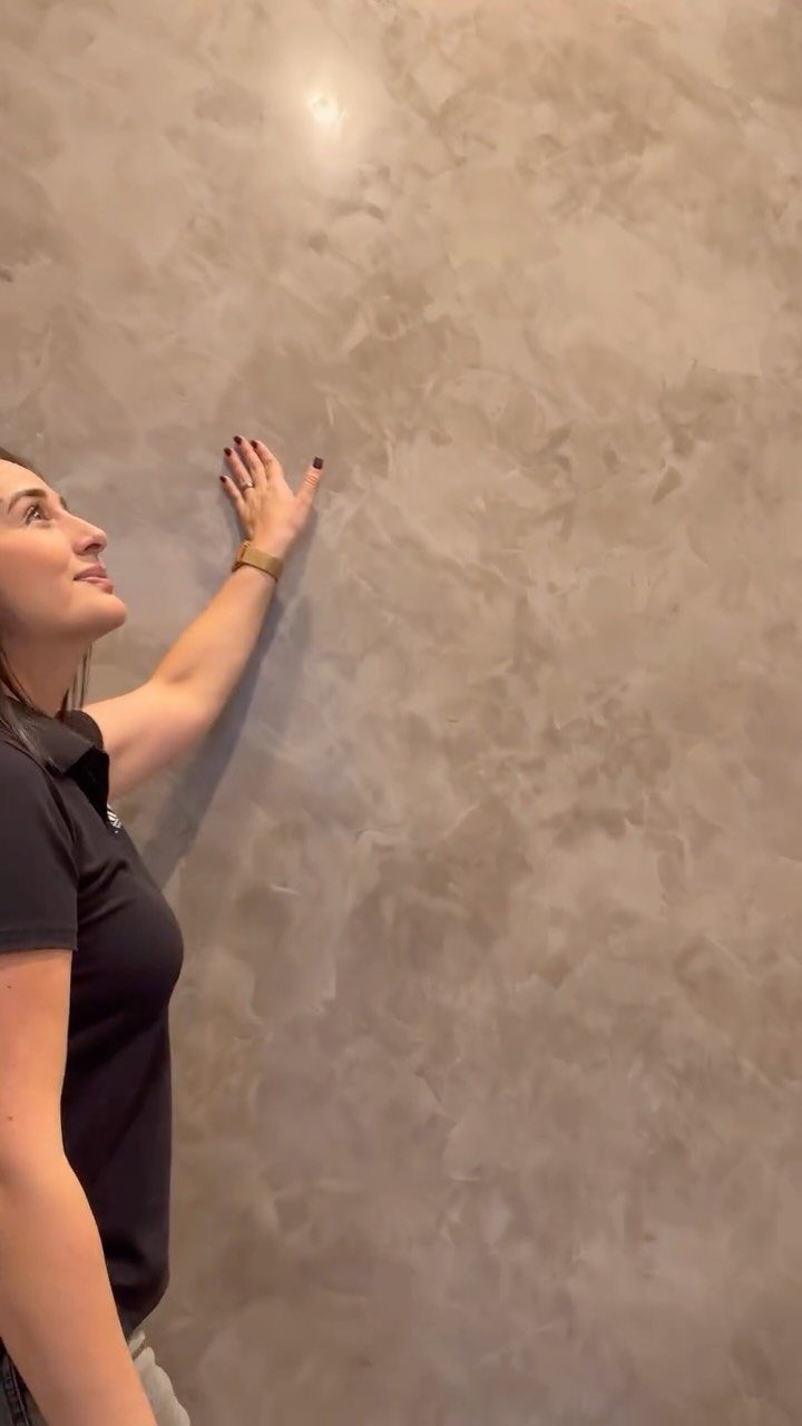
Venetian plaster asks for patience and a practiced hand. Marble dust in the mix provides the subtle sparkle; the gloss comes from burnishing with a steel trowel while the final coat is still damp.
Plan on multiple coats with curing time between them; rushing the build-up is where most DIY jobs fail. The result is less forgiving than paint, scratches show, and repairs require blending back through the layers.
I would not put this in a hallway or anywhere bags scrape.
For a first attempt, practice on a closet door or a single recessed panel. The technique translates best to spaces where you already own quality lighting; the finish needs it to perform.

𝗠𝗼𝗱𝗲𝗿𝗻 𝟯𝗗 𝗧𝗲𝘅𝘁𝘂𝗿𝗲𝗱: 3D wood slat design creates depth and visual interest while enhancing sound absorption. Great for Bedroom, office to reduce echo and noise, both practical and stylish

Premium Foam Material: High‑density foam with waterproof surface, shields walls from scuffs and stains

[ECO-CONSCIOUS LIVING] - We believe green is a beautiful foundation for any home. Crafted from renewable, plant-based materials and made through recyclable, eco-friendly processes, this green wallpaper brings a fresh, nature-inspired feel to your space. Free from harmful additives, it helps keep indoor air cleaner and healthier for everyday living. More than just decoration, it creates a calm, protective backdrop—perfect for supporting a more comfortable, wellness-focused home
10. Textured Wallpapers
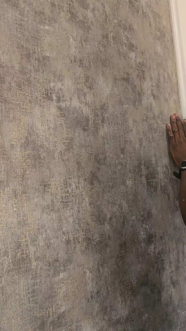
Textured wallpaper lets you borrow a surface you do not want to maintain in reality. Peel-and-stick versions now exist for renters, though the heavier embossed papers still need paste and a straight wall.
Kitchen installations suit the vinyl-coated grades, which wipe clean. A single feature wall in an otherwise flat room adds dimension without the commitment of texture on every surface.
The Anagalypta tradition, raised patterns from the late 1800s, survives in modern equivalents that cost more than flat paper but less than hand-applied texture.
Coverage per roll is smaller than flat paper because the texture eats up the repeat; buy more than the calculator says. Order extra for pattern matching; the texture makes waste harder to predict than with flat paper.

Premium Stainless Steel Construction: Made from high-grade stainless steel for superior durability, these trowels resist rust, corrosion, and staining for long-term use in plastering, painting, and finishing projects

【2 Sizes Trapezoid Venetian Plaster Trowel Set】Includes 2 trapezoid venetian plaster finishing trowels—9.3" x 5.3" x 4.3" and 10" x 3.3" x 4". The larger plastering trowel delivers faster, high-coverage smoothing, while the smaller one offers flexible control for detailed work. The trapezoid shape enhances control and improves access to corners and tight spaces. Its wider base boosts coverage, and the tapered sides increase maneuverability for quicker, more precise finishing

Stainless Steel Art Paint Finishing Trowel Set, Dazzling Tool for Artistic paint, Marmorino paint, Decorative modeling
11. Kitchen Concrete Texture Wall Design
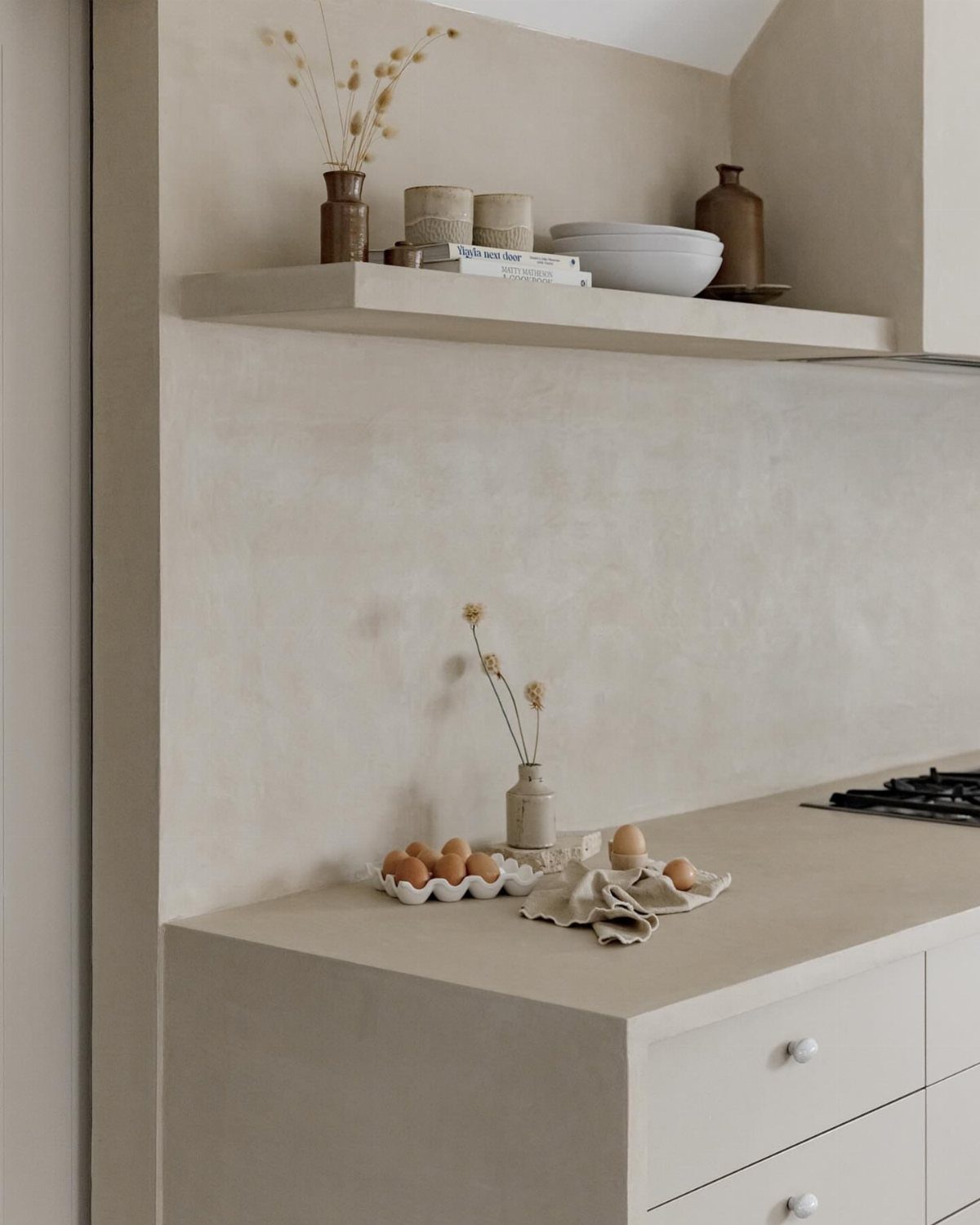
The matte surface hides minor splatter better than gloss paint, though it will mark if you scrub aggressively.
A sacrificial clear coat solves this; reapply on a schedule in the splash zone behind the sink, not when you notice the damage.
The look depends on pairing. If your existing kitchen runs ornate or colorful, this is not your texture.
For a DIY version, microcement overlays go directly onto tile or drywall. The process runs long enough that you need to plan around it: base coat, texture coat, then seal, with dry time at each stage.
Professional application costs several times more than materials alone; if you own or can borrow the tools, the savings are substantial.
12. Grasscloth Wall Texture
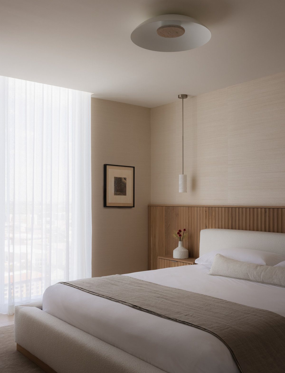
Grasscloth brings in the irregularity of natural fiber, which means every roll differs slightly and seams show more than with paper. Using it on a single wall, you would need to accept the panel lines as part of the look.
The texture softens sound, which suits living rooms or bedrooms over hard-surface flooring. Humidity is the enemy: bathrooms and unventilated kitchens will stain or loosen the adhesive over time.
Installation runs standard wallpaper prices, but the material itself costs more than vinyl and requires careful handling. The fibers tear if dragged across edges.
I would hire out this one unless you have successfully hung paper before.
Choosing the Right Wall Texture
Room size decides how much texture you can carry. Small spaces read better with fine or smooth relief; orange peel or Venetian plaster stay quiet enough that the walls do not close in.
Larger rooms handle bold surfaces without shrinking, though one feature wall is usually still the safer call.
Lighting changes everything. Side light across knockdown or geometric relief builds shadow; flat front light erases it.
Plan your fixtures before you commit to a texture, not after.
Your existing furniture matters. Stucco wants rustic surroundings; concrete texture needs a kitchen that is already restrained.
That same texture under the same light can read completely different once the room shrinks from open living space to a tighter bedroom.
Match the finish to your fabrics and flooring, and decide early whether you want a calm upgrade or a wall that carries the room.
Application Techniques for Textured Paint
Surface prep is where textured paint jobs fail or succeed. Clean, sand, and prime before anything else; the texture will not hide poor adhesion, it will advertise it.
The tool depends on the finish. Trowels and knockdown knives suit heavier relief; specialty rollers and coarse brushes handle additives mixed into the paint.
A stomp brush or stippling brush, built from coarse hair or fibers, makes its own pattern on walls and ceilings. For fine, even coverage like orange peel, a texture sprayer saves time and keeps consistency.
Test a small section first, on a board or in a closet. The motion is simple but the timing is not, and catching a bad consistency on a patch you can reach across beats having to rework an entire wall.
Position your fixtures to enhance what the texture creates.
Maintenance of Textured Walls
Dust settles deeper into relief than it does on flat paint, but the fix is regular and gentle.
Avoid abrasives. Scrubbing aggressively marks concrete and can tear the peaks off knockdown or orange peel.
Periodic spot painting keeps walls fresh, especially in high-traffic paths where bags scrape. For most textures, a small reserve of the original paint or compound saves matching trouble later.
Benefits of Textured Walls
Texture adds dimension that flat color cannot.
The practical advantage is hiding flaws. Small cracks, uneven surfaces, and the minor damage that shows over time disappear into knockdown or orange peel in ways smooth finish spotlights.
Sound softens on fibrous or irregular surfaces. Grasscloth in a living room over hard flooring soaks up echo; it does not belong in kitchens or baths where humidity swells the weave.
Modern textured materials carry water resistance and UV stability, which matters in sunlit rooms and splash zones. The outer layer also protects the structure underneath from everyday wear.
Frequently Asked Questions
What is the most popular wall texture right now?
Knockdown, orange peel, and Venetian plaster top most request lists in 2025. Knockdown sits between flat and rough, orange peel hides flaws on ceilings and small rooms, and Venetian plaster suits statement walls where you want depth with a polished surface.
The right choice depends more on your room’s size and light than on what’s trending.
How can I create texture on my walls?
Spraying, troweling, and brushing with compound or textured paint are the main routes. A sprayer lays down orange peel or knockdown; a trowel builds Venetian plaster or skip-trowel effects; brushes and knives create swirls or slap patterns.
Run your first try on a scrap of drywall or plywood: the hand motion is straightforward but the open time on joint compound is not, and it skins over faster than you think.