
These framed accent wall ideas run from a strip of 1×2 lumber to pre-cut double-frame kits that cost more than a single room’s typical project budget.
The deciding factor is how much of your wall you are allowed to change: renters who can only patch nail holes, renters who can paint over adhesive, or owners free to nail anywhere.
Every option here installs inside one weekend; the geometric diamond grid is the one that needs the most patience and a laser level.
[link-whisper-related-posts]1. Symmetrical Molding Arrangement
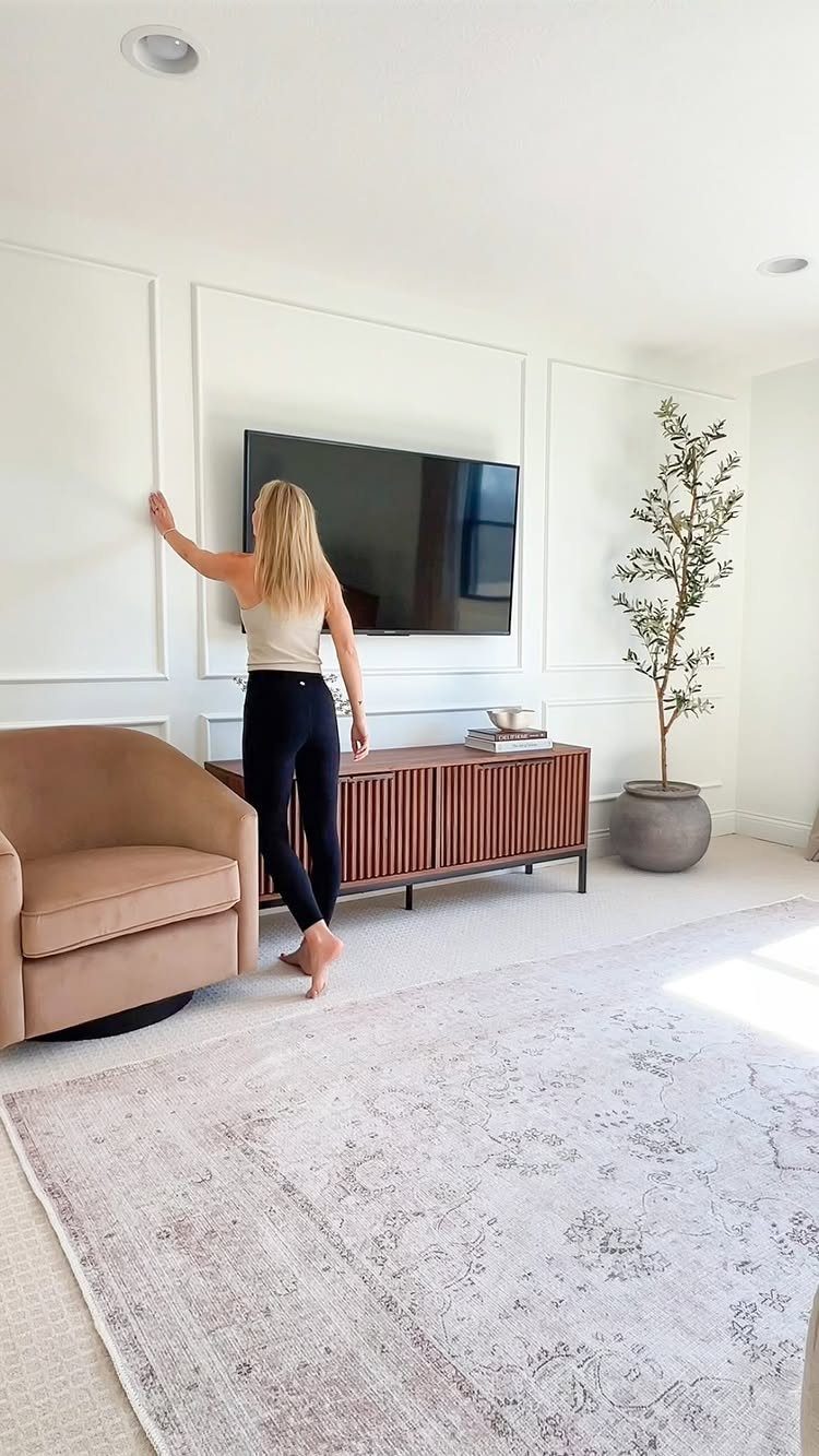
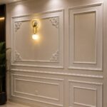
Large vertical rectangles flanked by smaller squares give a wall the look of built-in cabinetry without the carpentry bill.
I’d arrange the panels so the central one frames whatever sits below: a TV, a console, or a long low shelf.
Pre-cut kits shipped factory-primed are priced per frame by size, and a set covers enough wall to make a real statement without taking over the room.
Mitered corners come already cut, so the only saw work is trimming the last piece to fit your ceiling height.
This layout suits renters who can patch a few nail holes later; the molding is light enough to install with construction adhesive and a brad nailer in one Saturday.
Paint everything the same color as the wall and the shadows do the work.
MASS Studios designs custom media walls around the moments you want more of—relaxing by the fire, movie nights, date nights at home, entertaining and spending time together.

DIY Wall Panel Set: Wall molding kit includes 3 sets of pre-cut flexible wall decorations, each set has 8 pcs, total 24 pcs, can mix and match our different sizes to beautify your walls. Additionally, easily paint the trims in your favorite color(black,gold,blue,pink,green) to match any interior style-modern, farmhouse, vintage

Wall Molding Kit: The package includes 24 pcs wall molding (24in-14 pcs, 54in-6 pcs, 48in-4 pcs), which can be combined into 6 frames, allowing you to easily create a stylish accent wall. The 6-frame layout shown is designed for a wall measuring approximately 10 feet high by 11 feet wide. Please measure your wall and plan the layout before installation.

Transformative - Art3d pre-cut molding trim adds depth and character to walls, gives traditional elegance with a hint of contemporary refinement
2. Asymmetrical Molding Design
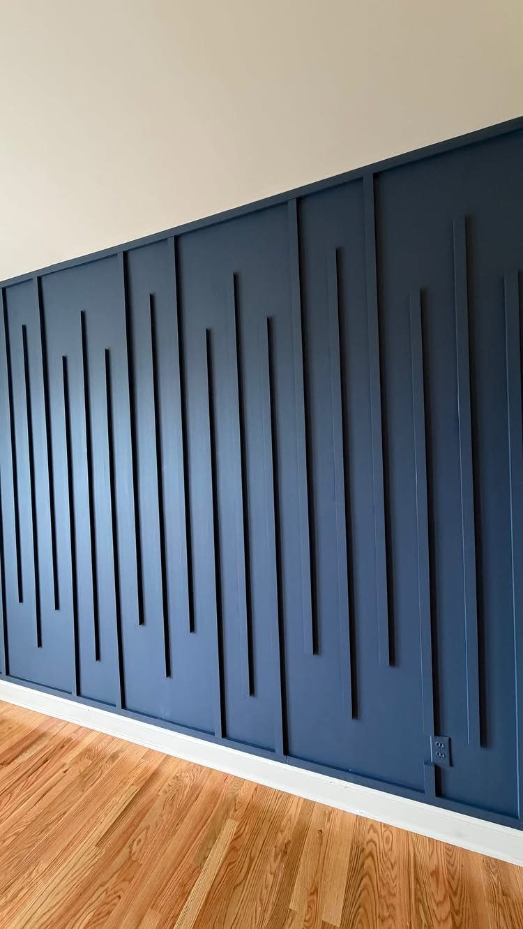
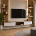
Navy slats cut to uneven lengths and spaced by eye read as intentional, not sloppy, because the gaps stay consistent and the baseboard gives them a clean foot.
Charcoal or light gray work the same way; keeping the wall color flat lets the slats read as texture, not clutter.
A 1×2 board ripped into strips costs less than you’d spend on a single accent pillow, and the raw lumber look suits a farmhouse wall.
I’d mark heights with a level, cut each strip individually, and attach with a pin nailer so holes disappear under paint. No mitering, no measuring twice: the irregularity forgives small mistakes.
This one wins for apartments where symmetry feels too formal. The vertical lines stretch a low ceiling, and the whole job paints over in a few hours when the lease ends.

Premade Wall Molding Kit: Our wall moldings are pre-cut, eliminating the need for tedious cutting and alignment, simplifying the installation process and making it easier for you to decorate your walls

Pre-Cut & Mitered Molding Strips to Build 4 Picture Frames: This kit includes pre-cut wall molding strips with precision mitered corners. The long and short pieces are designed to be assembled into four 20" x 20" decorative picture frames for wall paneling and wainscoting projects

Wall Molding Kit: you will receive 3 sets of pre-cut peel and stick molding for walls, a total of 12 pieces, which can be easily matched and connected to give a sophisticated look to a door or wall, meeting your various decoration needs
3. Double Frame Wall Molding
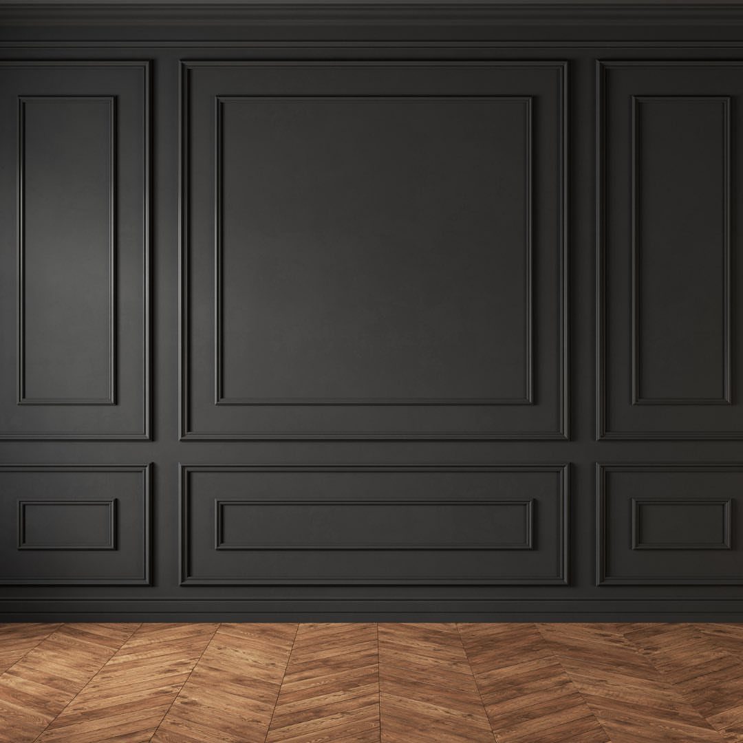
Two widths of trim stacked, one inside the other, cast a shadow that reads as expensive custom work from across the room.
The outer frame carries more visual weight, the inner frame sits tighter, with breathing room between them so the eye reads two distinct lines.
Pre-cut double-frame kits from shops like WondrWallz run higher than single-frame sets; you’re paying for the layered look and the time saved on layout math.
The wider trim carries the eye, the narrower one adds refinement, and the gap between them catches light differently at morning and evening.
Bedrooms benefit most: the depth softens a flat wall behind a bed without competing with headboard or bedding.
I’d paint the molding one shade lighter than the wall for quiet contrast, or match it exactly if the room already has patterned textiles.

All-in-One Design - Package of 20 premade molding trim slat + 4 decorative edge strip create instant board & batten walls

Complete Mixed Size Kit: this wood slat wall decor kit includes 37 pre-cut wood slats (each 1.6" wide x 0.4" thick) in 7 lengths: 8 pieces at 5.9", 8 at 7.9", 8 at 9.8", 4 at 11.8", 4 at 13.8", 2 at 17.7", and 3 at 21.7"; Also includes four 5.9 x 5.9 x 0.8-inch accent boards; Note: adhesive and hardware are not included

Mdf Material: board and batten wall panel kit is made of MDF, which is durable, waterproof, and easy to clean; The surface is smooth and burr-free, and feels comfortable to the touch
4. Framed Botanical Art
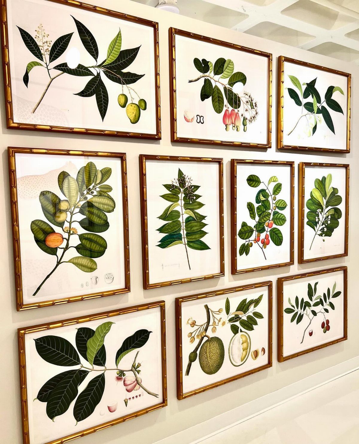
Bamboo frames and botanical prints against an off-white wall feel collected rather than decorated, especially when the illustrations share a palette of muted greens and faded ochres. A navy textured wall behind them tightens the whole arrangement into something intentional.
Two rows of prints, spaced close enough to feel like one unit, fill enough wall width to anchor a sofa or a bed without needing anything else.
I’d buy the frames first, lay the arrangement on the floor, then hang from the center outward. Thrift stores and print-on-demand shops carry the art; the frames do more work than the images.
This suits renters who cannot alter walls at all. Command strips hold light bamboo securely, and the whole gallery travels to the next apartment.
For a permanent install, I’d paint the wall behind in a navy with subtle texture so the frames float instead of sinking.

Bilinear Frame Design:This set of wall panels consists of 6 outer frames and 6 inner frames, with a total of 68 molding trims.The inner and outer double-frame design builds multi-level visual depth,injecting more artistic sense than ordinary single-frame alternatives!You also can experiment with different spacing and quantities,mix and match our different sizes to add variety to you space,dress up your room the way you want!Please measure your wall before ordering to ensure correct purchase

PACKAGE INCLUDES:Each grooved wood trim measures 15.75 inches (40cm) in length, 0.98 inches (2.5cm) in width, and 0.43 inches (1.1cm) in height. The set includes 8 pieces, providing enough quantity for multiple home improvement and DIY projects such as wall molding, furniture edging, and frame making.

Cozylkx Moulding Trims are made from High Quality PE Foam, soft, high elasticity, anti-collision and durable, help decorating your home to be more warm.
5. Molding with Vertical Slat Paneling
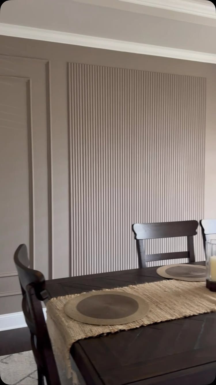
Vertical slats beside framed molding panels split a wall into two textures without two ideas fighting. The slats run floor to ceiling in one section, the molding organizes the other, and a door frame or corner naturally divides them.
Taupe keeps both elements in the same family; charcoal slats against a lighter wall would read as bolder.
Pre-cut MDF slat panels install with adhesive, though I’d add a few finish nails at stud locations to keep them straight through seasonal shifts. The molding frames beside them follow the same layout as any picture-frame wall.
Dining rooms suit this especially: the slats absorb sound across a table, and the molding gives the eye somewhere to rest between courses.
I’d keep the slat section to the shorter wall, the molding to the longer one, so the room does not feel chopped in half.

What You Will Receive: you will receive 3 sets of pre cut wall decorations, each set has 10 pcs, total 30 pcs, which can be freely matched according to your needs, they attaches easily and gives doors or walls elegant finished look

【Long-Lasting & Paintable】Crafted from high-quality polystyrene, this wall moulding frame is waterproof and moisture-proof, and will not deform or crack. Unlike soft PVC molding trim, it's hard and sturdy, the edges won't lift up, which can stay straight and align seamlessly for a professional finish. Its smooth white surface is paintable and easy to clean, allowing full customization to match your home décor style

What You Will Receive: you will receive 3 sets of pre cut wall decorations, each set has 10 pcs, total 30 pcs, which can be freely matched according to your needs, they attaches easily and gives doors or walls elegant finished look .
6. Picture Frame Wall Molding
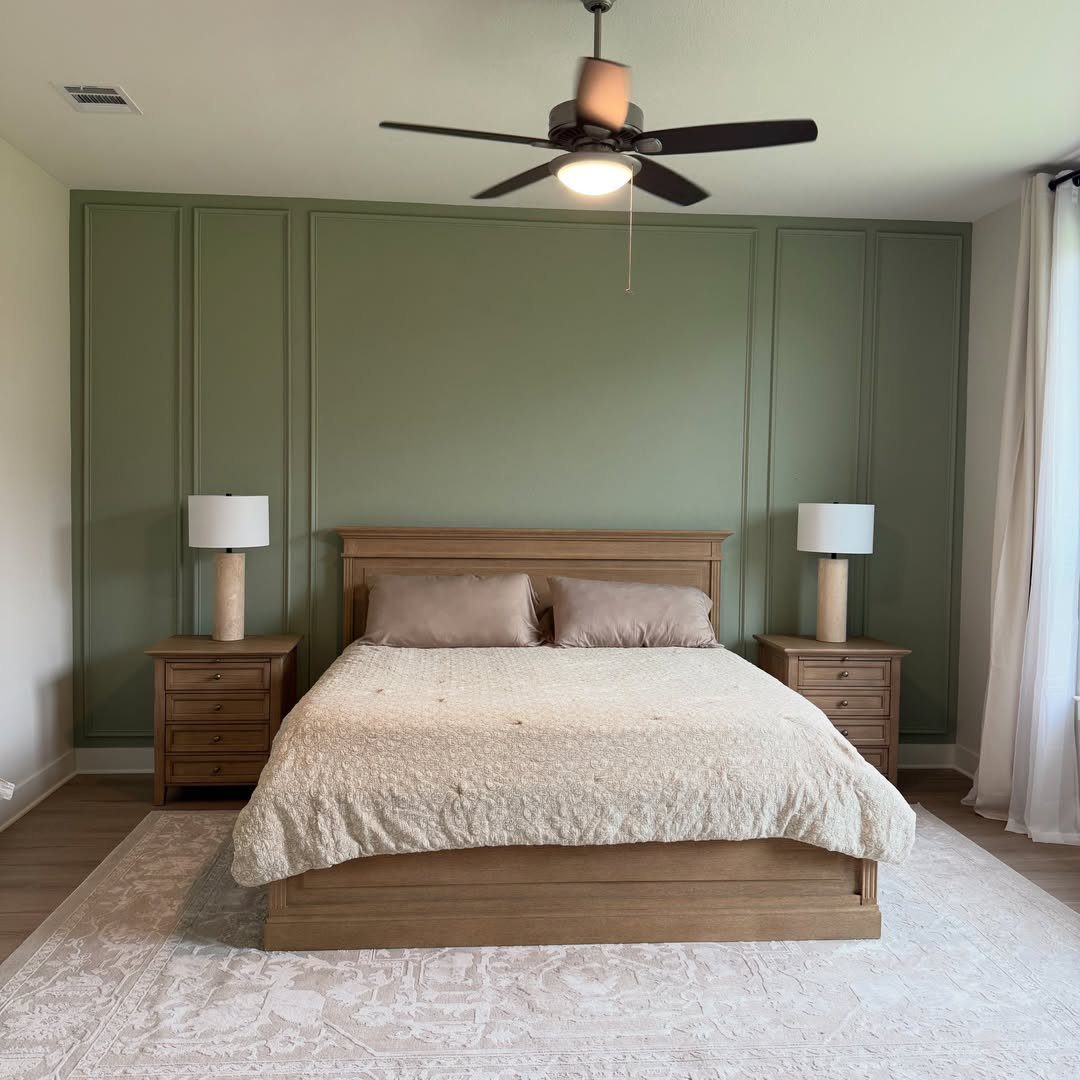
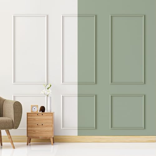
Floor-to-ceiling rectangles in sage green turn a bedroom wall into architecture without touching the structure. The panels run from baseboard to ceiling line, sometimes with a chair rail height break, sometimes continuous.
A kit with large panels covers serious wall footage if you buy pre-cut; raw trim from a lumberyard costs less but needs a miter saw and patience.
I’d paint the wall and molding the same color, in a matte finish that hides imperfect joints, and install the bed so it centers on the middle panel or splits the gap between two.
This one skews traditional in proportion but reads modern in a deep green or matte black. Warm wood furniture keeps it from feeling cold; I’d avoid metal frames or glass-topped nightstands that compete with the lines.
The ceiling fan in the visible setup is optional, but the height of the panels demands a tall room; in standard ceilings I’d stop the molding well below the crown.

MDF Material for Lasting Use: this board and batten wall panel kit is made from MDF, offering sturdiness and water resistance; The surface is smooth, providing a comfortable touch for interior wall applications
[Transformative Interior Decoration]: Our pre-made wall moulding kit effortlessly adds depth and character to your wall, blending contemporary minimalism with classic design. Elevate your interior wall with timeless elegance

Complete Wall Molding Kit – Create 6 Elegant Frames: This set includes 24 pre-cut molding pieces (14×24in, 6×54in, 4×48in), designed to assemble into 6 decorative wall frames. Perfect for walls approx. 10 ft x 11 ft, helping you easily achieve a high-end wainscoting look.
7. Picture Frame Wainscoting
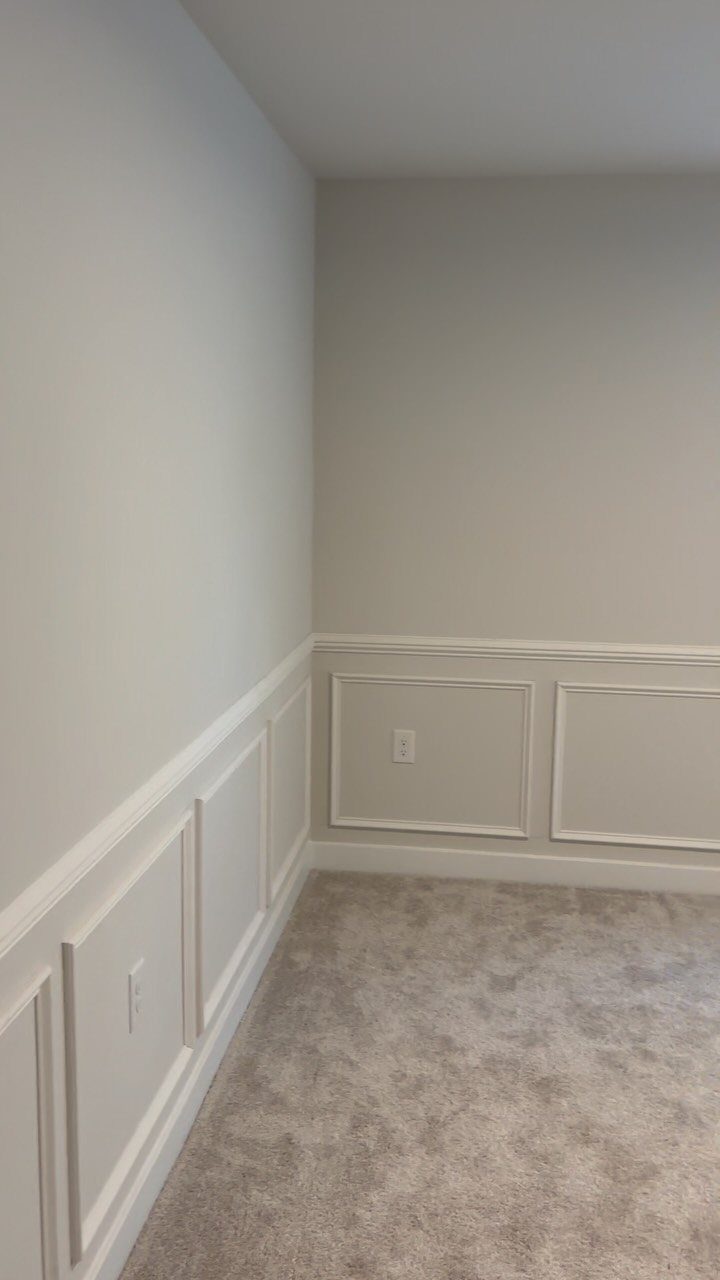
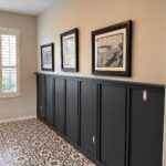
Picture frame wainscoting splits the wall at chair-rail height and builds the framed detail below, not above. The lower third or half becomes the accent; the upper wall stays quiet, which keeps a small room from feeling boxed in.
White molding against light gray reads as clean architecture rather than decoration. Paint the molding and rails the same finish so seams disappear.
Pre-cut kits with chair rail and boxes ship ready to miter, and the price lands in the same range as a mid-size room project.
The look stays quieter than a full accent wall, which is the point if the room already has busy fabrics or a bold rug.
If your room already has busy flooring or furniture, the lower placement keeps the eye from fighting too many directions.

ADHESIVE THAT ACTUALLY HOLDS: Every piece arrives with industrial-strength adhesive already applied — no glue, no nails, no brad gun, no mess. Just peel the backing and press. The bond grips on the first contact and stays gripped, so your wall molding will not curl at the corners or drop off the wall weeks later like cheaper peel and stick molding.

PRE-CUT & GLUE-ON INSTALLATION FOR EASY DIY UPGRADES: Each kit includes pre-cut wall molding pieces designed to create elegant picture frame layouts without complicated measuring, sawing, or miter cuts. Simply align, adjust, and install with suitable adhesive for a professional-looking accent wall

Easy DIY Installation: Our peel and stick wall molding features a strong self-adhesive backing that makes installation quick and effortless—no cutting, drilling, or special tools required. Simply peel, stick, and press to upgrade your accent wall instantly
8. Geometric Diamond Molding
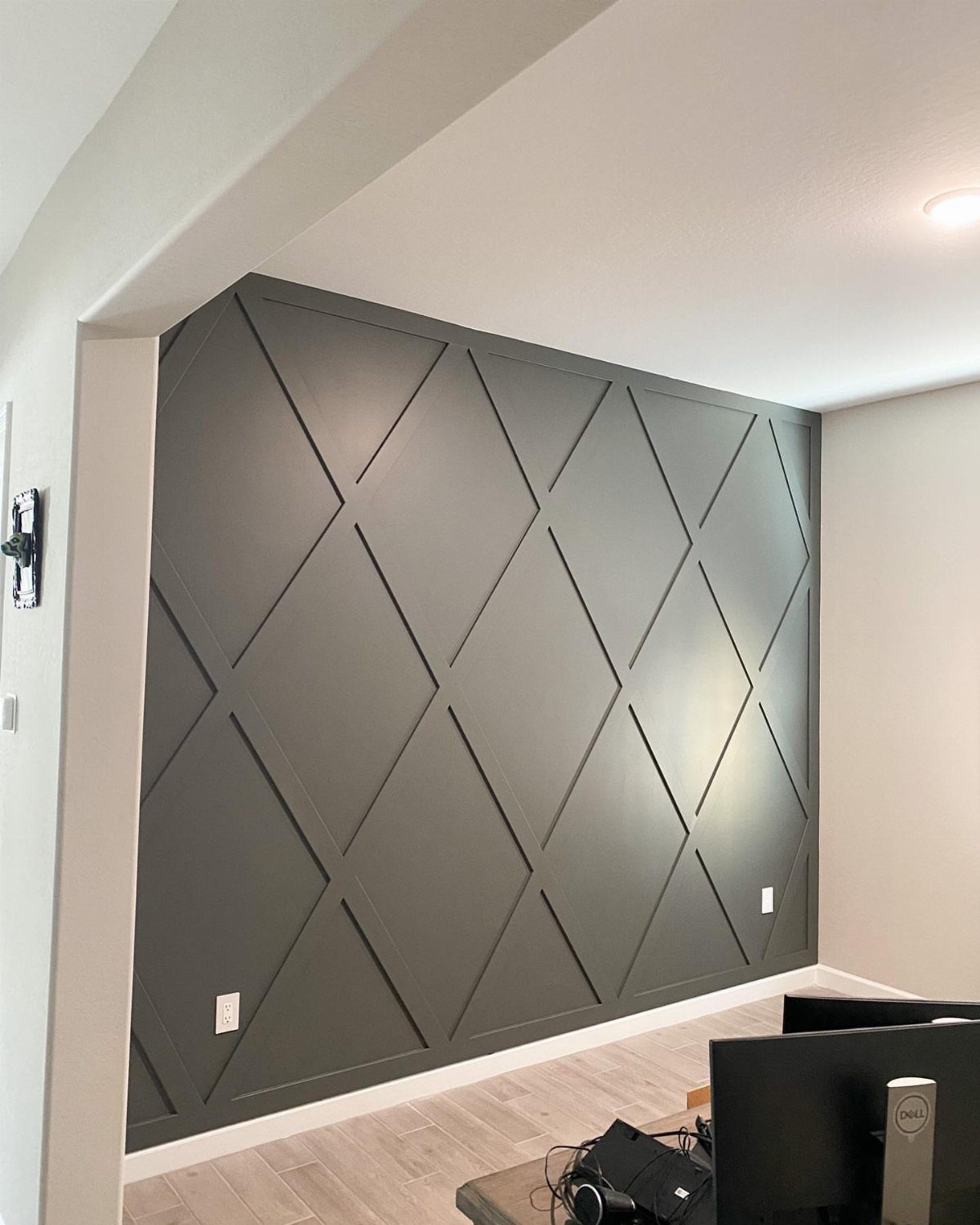
Dark gray paint behind raised diamond molding gives the pattern its depth; the same color everywhere would flatten the whole thing into texture alone.
Diamonds running in a repeating grid read as wallpaper from across a room and as hand-built trim up close.
Map the grid with a laser level and painter’s tape before cutting any wood. Half-inch MDF strips, primed and painted to match the wall after install, keep a short run cheap enough to finish in one Saturday.
The dark color hides the seams better than white would.
This one asks for patience and a free weekend. I’d point a beginner toward the symmetrical molding entries first; the diamonds need every angle right.
A desk or bed against this wall works better than open floor space, since the pattern competes with nothing but itself.

𝗠𝗼𝗱𝗲𝗿𝗻 𝟯𝗗 𝗧𝗲𝘅𝘁𝘂𝗿𝗲𝗱: 3D wood slat design creates depth and visual interest while enhancing sound absorption. Great for Bedroom, office to reduce echo and noise, both practical and stylish

Transformative - Art3d pre-cut molding trim adds depth and character to walls, gives traditional elegance with a hint of contemporary refinement

【Premium Polystyrene Wall Molding】Crafted from high-density PS (polystyrene), these panels are lightweight yet significantly more rigid and durable than foam or PVC alternatives. The sturdy, deformation-resistant structure provides a sophisticated wood-like finish that elevates your interior wall decor for years to come.
DIY Installation Tips
Mitered corners arrive already cut in pre-cut kits, which removes the hardest part of trim work.
I’d still buy a brad nailer rather than rent one; the price is low enough that it pays for itself on the second project and leaves hands free for holding pieces level.
Construction adhesive works on its own for lightweight molding, but I add a nail at each stud for extra hold.
A laser level saves hours of marking; the red line stays visible across flat paint but washes out on dark walls, so I mark with pencil first on charcoal or navy.
Paint before install if you can. Touch-ups at joints hide faster than cutting in around every frame after.
For apartments, adhesive-only installs peel cleaner if you warm the bond with a hair dryer before pulling.

Three Complete Double-Layer Sets: Includes 60 pre-cut pieces, 20 per set, to create three inner-and-outer wall molding frames; the layered design adds depth and structure to an accent wall

You Will Receive: 1 set of precut wall molding kit with French corners, consisting of 20 lines and 4 corner flowers, mix and match to design your dream wall or door decor; You can also DIY to create your favorite style according to your needs to add elegance to your space; They are easy to connect and bring finished appearance to doors or walls

Color and Size: our decorative line strips are made of non-traditional wood colors, which can easily blend into your decoration and add a touch of understated elegance; The size is 15.8 x 1.6 x 0.6 Inch (40 x 4 x 1.5cm), designed to an ideal proportion, easy to install, and will complement your wall
Color and Material Choices
Sage green reads modern on picture-frame molding, warm and traditional in a bedroom with wood furniture. Charcoal and light gray suit asymmetrical work where the texture, not the color, carries the idea.
Polyurethane trim resists moisture in bathrooms but feels hollow under knuckles. Real wood takes paint more evenly and fills nail holes with putty that matches.
MDF is the middle ground: factory-primed, consistent, heavy enough to need adhesive plus nails.
Matte finish hides imperfect joints better than satin. A shade just off from the wall color adds quiet depth without shouting for attention; paint it the exact same color and only the shadows define the shapes.

【Simple & Quick Installation】Achieve a professional accent wall effortlessly with our pre-cut wall molding kit. Designed for easy application using adhesive or glue (not included), it eliminates the need for complex tools or techniques. Perfect for both novice and experienced DIYers seeking stylish wall accents.

Damage resistant: Birdeco's premade wall molding kit is damage resistant, ensuring it withstands impacts and scratches for long-lasting quality.

🌈Dimensions: length 6 meters, width 12 cm (4.7 X 236.2 inches)
Accent Wall Trends
Geometric patterns now run large-scale and hand-built rather than wallpaper-repeat.
Asymmetry has shifted from accident to intention: uneven slat lengths with consistent gaps, or grids that start and stop at door frames rather than wrapping whole rooms. The look suits renters who want presence without permanence.
Art integration means frames and molding share the wall as one system.
Frequently Asked Questions
Are accent walls out of style in 2026?
Accent walls built with molding, slats, or framing are still going strong because they add actual architecture rather than just color. 8 framed styles suit 2026 budgets and weekend timelines, from symmetrical molding to geometric diamonds.
What faded is the single painted wall with no texture; the current interest is in shadow, line, and material that reads as built-in.
What is the rule for accent walls?
One wall carries the detail so the room does not feel boxed in or chopped in half. Picture-frame wainscoting keeps the framed detail below chair-rail height and leaves the upper wall quiet.
What to do instead of an accent wall?
Framed molding arrangements, vertical slat paneling, and botanical galleries give the same focal point without committing an entire wall to one color or pattern.
Symmetrical molding reads as built-in cabinetry, while bamboo frames with botanical prints hang with Command strips and travel to the next apartment.