Interior color schemes run from a single can of warm white to a full room of charcoal and brass, and the right one depends on whether you can repaint or only rearrange.
Renters stuck with beige walls will land in the monochromatic neutrals; homeowners willing to test a winter afternoon’s light might take the dark route with olive green and gold.
The common thread through all 9 is that paint color only works when you match it to what the room already gives you: north light, low ceilings, or the oak grain of your largest piece.
[link-whisper-related-posts]1. Monochromatic and Neutral Schemes
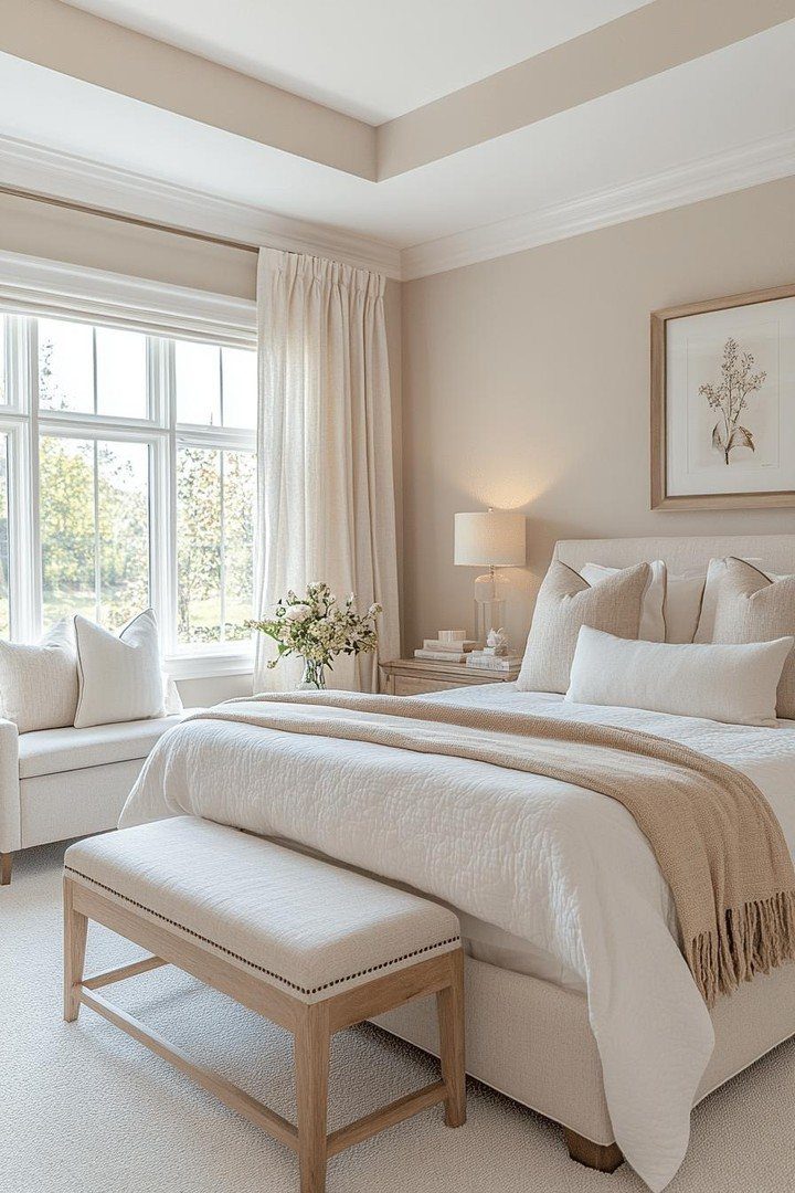
A single neutral tone, pushed through every texture in the room, does more than simplify shopping. It trains your eye to notice what changes: the weave of linen against plaster, the grain of oak against wool.
A narrow range of cream, white, and tan makes each surface read as intentional rather than leftover.
Start with your floor and largest piece of furniture, then let everything else drift one or two steps lighter or darker.
A throw in raw silk or a vase with dried grass adds the slight warmth that keeps beige from going flat.
This suits renters who cannot repaint and homeowners who want one palette to carry through awkward transitions: hallways, stairwells, the gap between kitchen and living room where styles usually clash.

Ready to use, pre-mixed door and trim paint offers a fresh new look on interior or exterior metal, wood and fiberglass

COLORS CRAFTED BY ANNIE SLOAN: A timeless off-white, that works with everything. Old White is a sophisticated and understated neutral that will give your walls a soft, chalky, traditional look and feel.

ALL-IN-ONE PAINT KIT - CIONIA all match paint kit includes essential painting tools and combines paint + primer in one water-based formula, helping you complete DIY furniture and home painting projects faster and easier with minimal preparation.
2. Warm White for Farmhouse Style
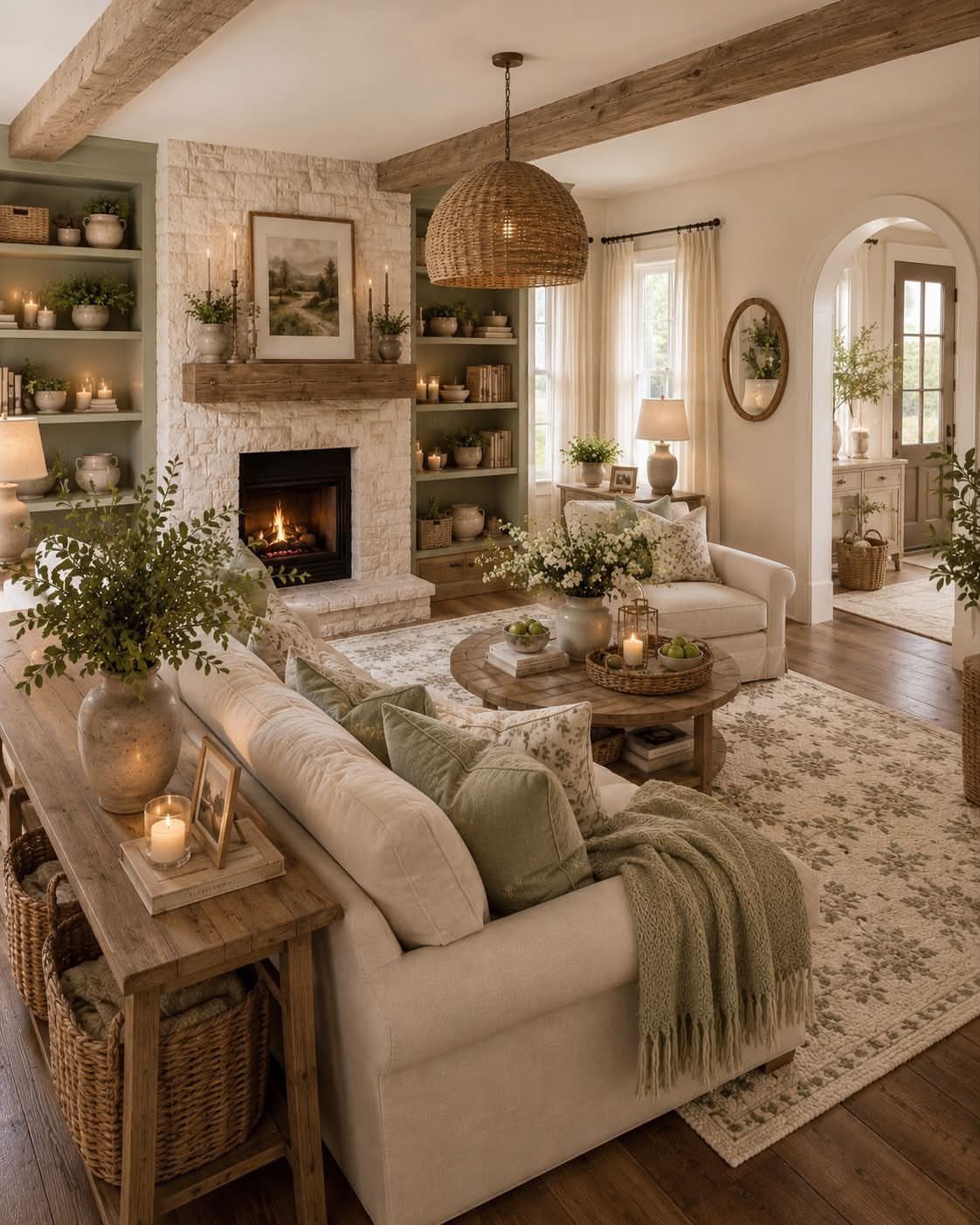
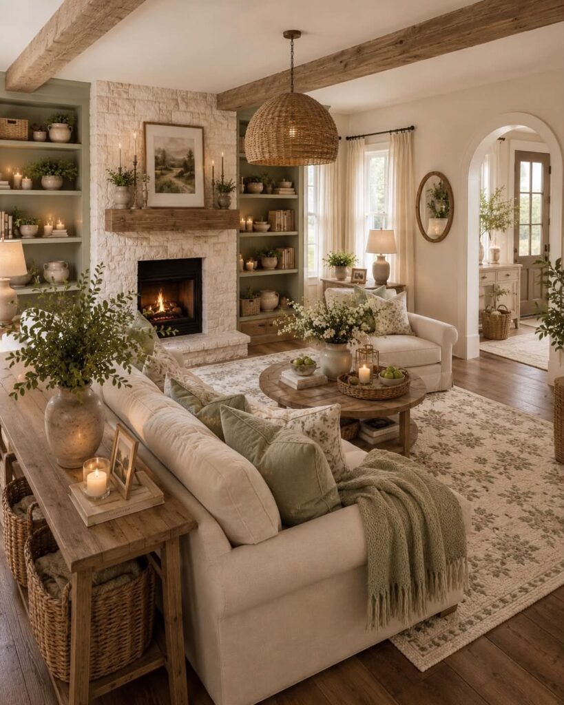
Farmhouse warmth lives in the gap between stark white and true cream.
Walls that read as white until you set a sheet of printer paper against them let a stone fireplace and raw beams feel settled rather than rustic props dropped into a modern box.
Paint matters more than furniture here. Benjamin Moore White Dove or Farrow & Ball School House White both carry enough yellow to catch afternoon light without going buttery.
Test on the wall that gets the most sun, not the one behind the sofa, because north light will flatten anything too gray.
Sage pillows and woven pendants work because they repeat materials already in the house: linen, unbleached cotton, wood left unfinished. The scheme fails when you add too much new color trying to prove the style.
One green, one warm metal, and stop.

【Home Decor Ceramic Vases Set】More than vases, they are wonderful home decor. This vases set of 3 is perfect for artificial flowers or dries plants, can be placed individually or in combination, as a decorative vase for centerpieces, mantel, fireplace, dining table, living room, bedroom, desktop, bookshelf, entryway, minimalist side table and so on.


Versatile 3-Piece Decor Set More than just vases, this curated set of three ceramic pieces is designed to elevate your home decor. Their neutral tones and varied shapes allow you to style them together as a striking centerpiece or separate them to accent multiple rooms—perfect for mantels, dining tables, shelves, consoles, or minimalist side tables.
3. Dark Color Schemes
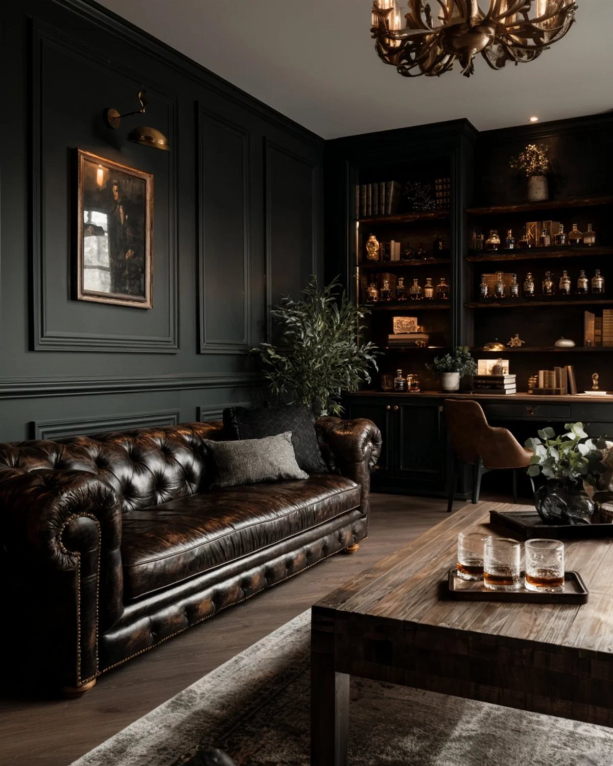
Charcoal walls swallow light differently in morning and evening, which is the point. Black paneling, a brown leather Chesterfield, and a single brass chandelier keep a dark room from becoming a cave.
The wood coffee table matters: it reflects almost nothing but warms the eye by breaking up the dark mass.
Before you commit, check your natural light on a short winter afternoon, not a summer evening. A room that reads moody in summer turns oppressive when the sun drops by 5.
Add lamps at three heights: a pendant for the center, a floor lamp for the corner where you read, and a small table light for the shelf. Mirrors opposite windows do more than decorative art here.
Dark floors with dark walls need a light rug or the gradient tips too heavy. Built-in bookcases work because their contents add variation; fill yours with mixed materials, not uniform spines.
Natural Cascading Greenery: Long vintage cascading eucalyptus add soft vertical texture without the upkeep of a live plant. Layered sage-green leaves and flowing strands create an easy decorative accent that fills bare edges with lasting greenery.

Boho Chic & Striped Design: Elevate your home decor with our stylish striped corduroy pillow covers, bringing a touch of Boho elegance and warmth. The unique pattern seamlessly blends with various interior styles, from modern to farmhouse, creating a relaxed and inviting atmosphere in any room.

Farmhouse Charm: Each bead is carefully crafted to exude rustic elegance, adding a touch of handmade charm to your space
4. Blue House Color Schemes
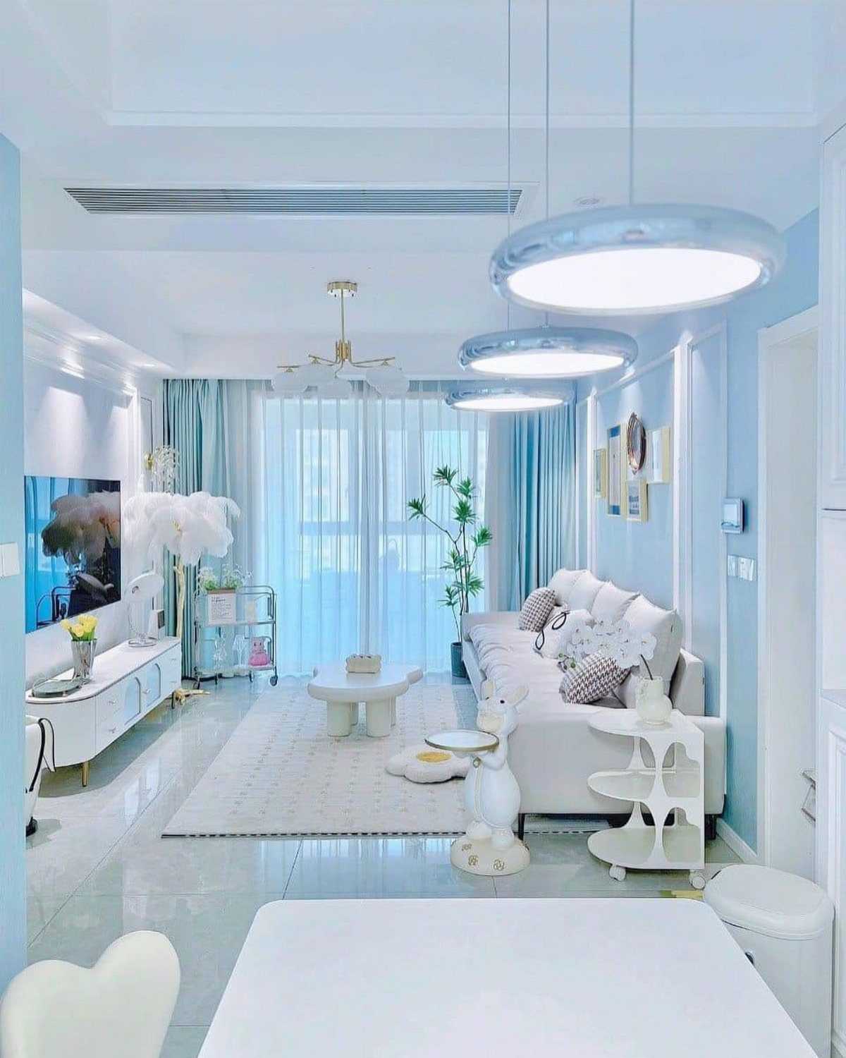
Blue walls carry the sky into a room, but the tone decides whether you get calm or cold.
A light blue with enough gray stays quiet in overcast light, and white furniture that would look sterile against a clearer, brighter blue feels right here.
Soft sky blue suits south-facing rooms that get too much glare; deep navy works where you want the walls to step back and let furniture or art advance.
Curtains that match the walls extend the field and make the window feel larger. Painting trim the same blue, not white, pushes this further.
Pair with warm metal if the blue goes purple in your light, with raw wood if it goes green. Test both at the paint store by holding brass and oak chips against the wet sample.

Ideal for use on interior/exterior surfaces including wood, plastic, plaster, metal, masonry and unglazed ceramic

Bonds to vinyl, plastic and rubber

Renews and protects discolored bumpers and trim
5. Soft Pastels and Muted Colors
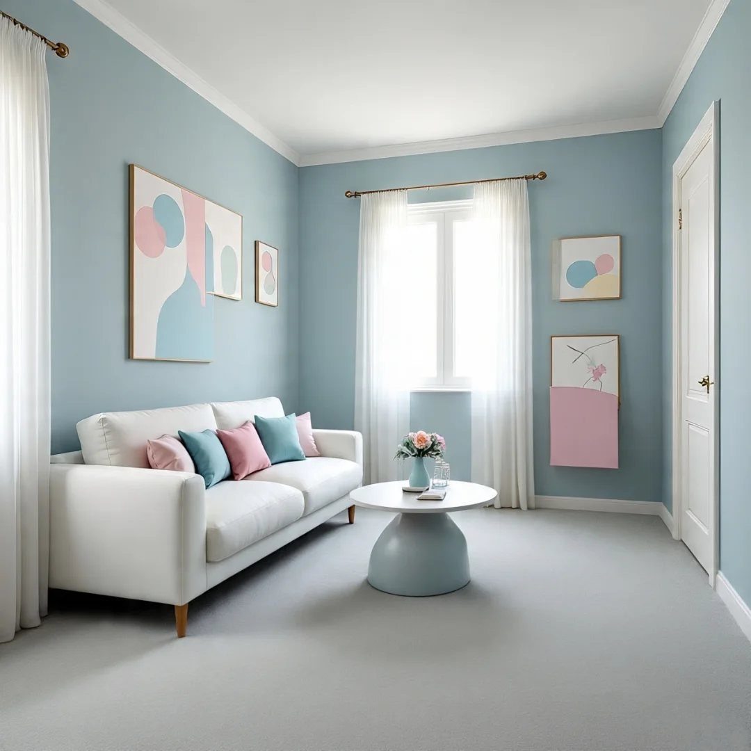
Pastel rooms live or die on saturation, not hue. Pink and teal read as gentle because they are muted, not because the colors themselves are soft.
A cleaner, brighter pink would turn the same sofa toward a child’s room.
Color drenching, running one pale tone across walls, trim, and ceiling, works best in small rooms where you want the walls to dissolve. Several newer built-for-this palettes pull from this same idea.
The effect is cocoon-like, not claustrophobic, because the single tone removes the edges that usually box a room in.
Bedrooms and bathrooms suit this most, places where you want to lower the volume. Keep floors light: pale wood, stone, or a gray rug no darker than the walls.
Dark flooring under pastels makes the room feel anchored in mud.

Inspirational Quote Wall Art: Featuring the uplifting “How Lucky Are We” quote with a trendy olive green striped background, this framed canvas print adds a positive and stylish touch to your living room bedroom or dorm decor while enhancing the overall aesthetic atmosphere

Package Included: you will receive 2 pieces metal wall planter decors and 2 pieces plastic fake plants, which can match well with each other and are ideal for making your home or office more colorful and vibrant

[QUALITY]Metal material, Quality Gold metal base is strong and durable, Hot stamping numbers and Gold hand for easy reading time, Entry lux and Retro design.
6. Modern Color Schemes
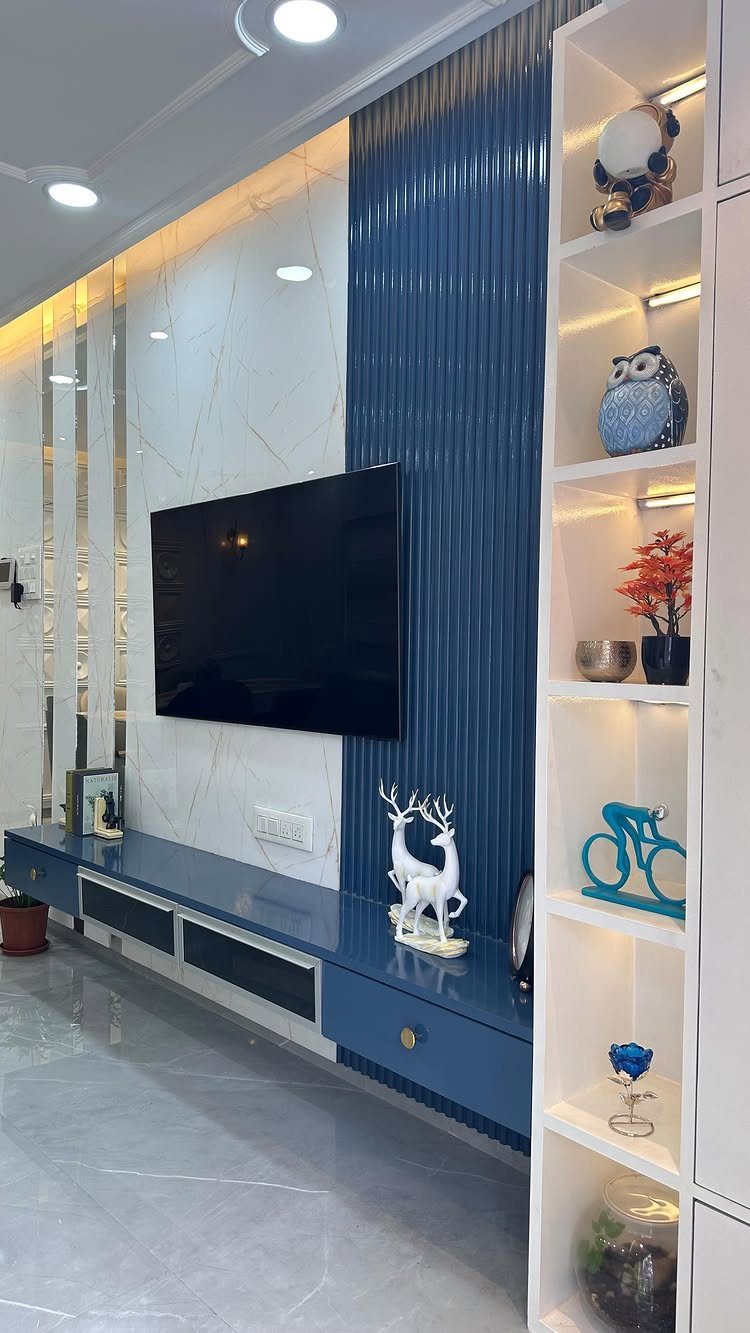
Modern color schemes do not mean all white. Without it, the white shelving and media setup would read as storage, not design.
Start with one neutral foundation, one accent, and one metal. Here it is white, blue, and the implied chrome or nickel of the hardware.
The fluting adds texture so the blue does not read as flat paint; vertical lines also draw the eye up, which helps low ceilings.
This suits renters who can change one wall or install a single panel without repainting the whole room.
The bold accent goes where the eye naturally lands: behind the television, along the sofa wall, or on the door you face when you enter. Keep the other walls quiet and the floor uninterrupted.
Self-Priming formula - requires no sanding
Ultra premium paint and primer in one
7. Gray Color Schemes
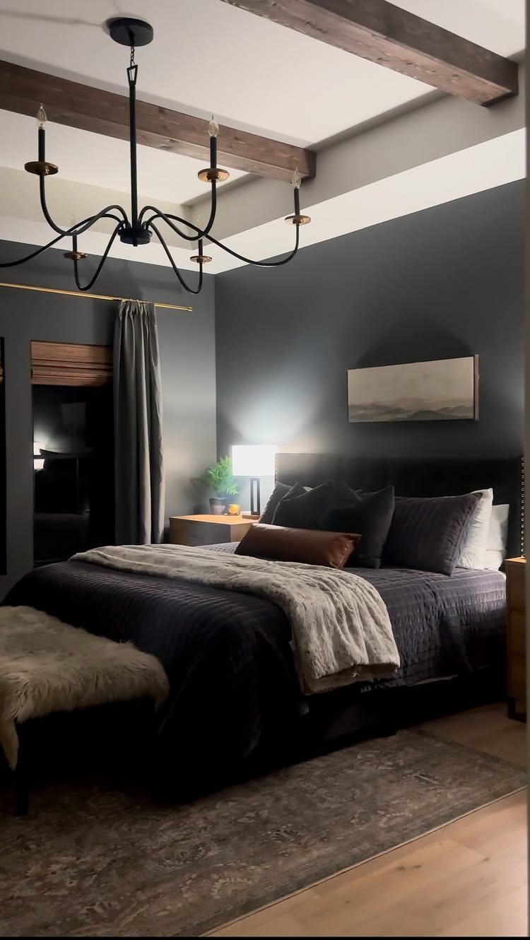
Gray lives up to its reputation as the wall color that does not fight with anything.
A bedroom that goes nearly black with gray, ceiling beams and all, still reads as pulled-together rather than cave-like when the bedding shifts through charcoal into lighter gray with a nubby throw on top.
That layering is the whole trick: flat gray on flat gray looks like a rental unit, but three tones plus texture reads intentional.
If you are starting from white walls, a light gray and crisp white pairing stays readable for years without going cold. Woodwork or a single plant on the nightstand adds the warmth that gray does not generate on its own.
I would keep the gray on walls and textiles, not large wood furniture, to avoid the muddy zone where gray and brown compete.

【Perfect Size】Large: 8.3"L × 7.8"H;Medium: 7"L × 6.7"H;Small: 5.3"L × 5.1"H.

CAREFUL SELECTION: All stems in this pompas grass are natural dried plants and carefully selected by us. special faux pampass grass bundle manufacturing technique ensures superior quality, and dried pompous grass lasts up to three years.(without pampas grass vase)

【Aesthetic Neutral Tones】Set of five modern matte vases in beige, taupe, clay, gray, and charcoal. These home decor vases bring natural warmth to living room or office décor, fitting effortlessly into neutral spaces.
8. Jewel Tone Color Palette
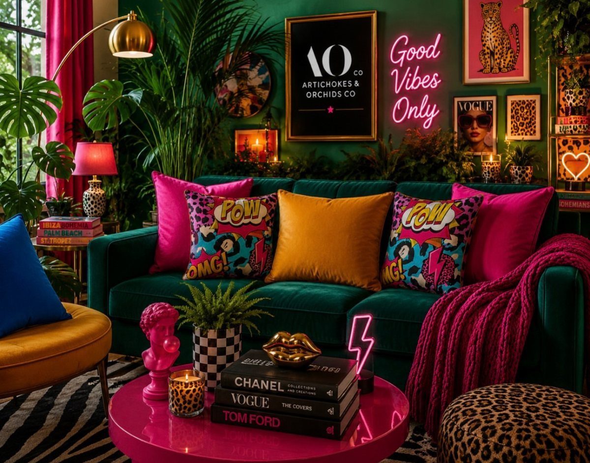
Jewel tones work best when you commit to at least two of them at full saturation rather than dipping a toe. A deep green sofa with hot pink accents needs no apology; green walls push the pairing even further.
Velvet handles this weight better than linen or cotton, which tend to look stained under heavy color.
For 2026, teal and burgundy are both showing up strongly in forecasts, and teal in particular carries a room without the coldness that blue sometimes brings.
I would add one complementary pop somewhere unexpected, like a red credenza in a green bedroom, rather than keeping every piece in the same family. That break keeps the eye moving and stops the space from feeling like a set.

[Durable & High Quality]: NOTE: PILLOW INSERTS NOT INCLUDED. Made from polyester blend fabric and designed with a durable hidden zipper for easy removal and cleaning. Refresh your home Decorations with the couch throw pillow cover 12 x 20.

[Perfect 72 Inches Long] Our macrame table runner with tassels measures 12 x 72inch, fits a dining table that seats 4-8 people. It can give your tables a rustic and boho look. (Because it is folded in the bag, when you take it out, the table runner will have creases, which will affect your measurement. So, please make sure the table runner is placed neatly and flat before measuring)

Safe and Skin-friendly: our crib skirts are made of 100% washed cotton, ensuring softness, breathability and non-irritation, safe and gentle to baby's delicate skin
9. Olive Green and Gold Scheme
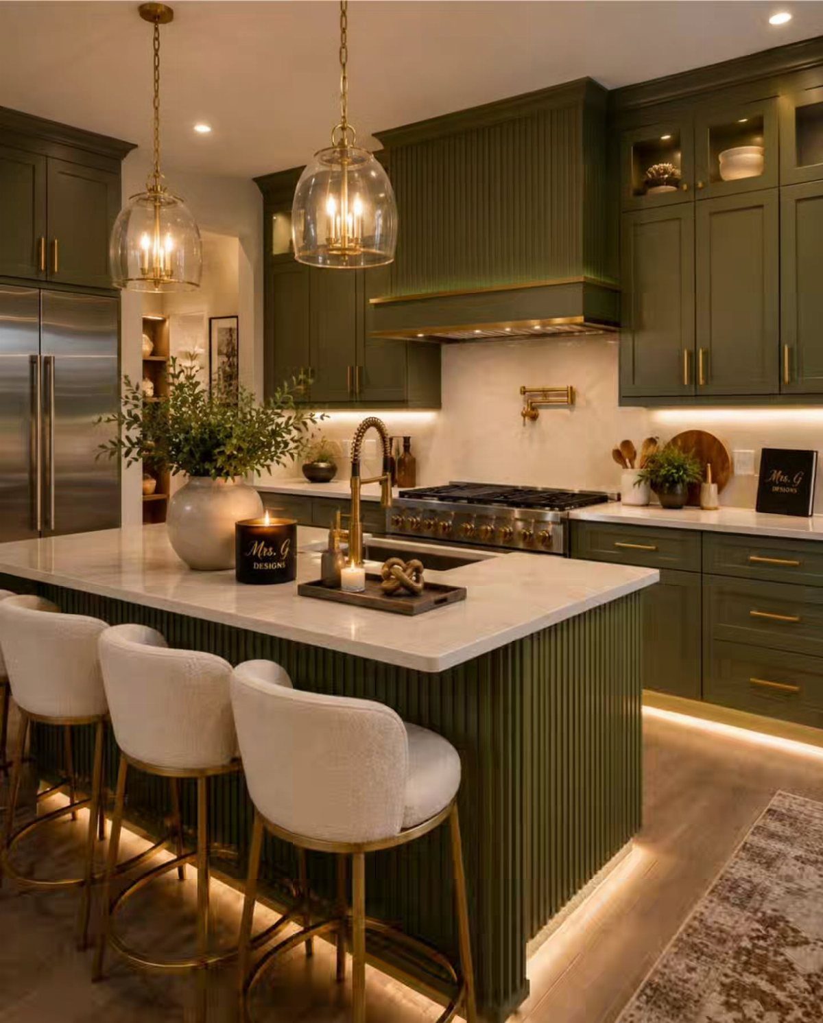
Olive green and gold carry a mid-century memory that still feels current when the green is muted and the gold is brushed rather than bright.
Fluted olive cabinets, white marble that stays cool against the warmth, and gold hardware with matching pendants that do not shout get the balance right.
Mustard is the alternate if olive feels too safe; the two share that same mid-century lineage and both warm up against white.
I would keep the gold to hardware and lighting, not large appliances or sinks, to avoid the brass-heavy look that dated quickly a few decades back.
The vertical fluting on the cabinets adds shadow and interest without a second color, which helps when the palette is already restrained.

Use for a variety of indoor and outdoor project surfaces including wood, metal, plaster, masonry or unglazed ceramic

ALL-IN-1 PAINT & PRIMER: A hardy multi-purpose and multi-surface one-coat paint and primer in one for almost any indoor or outdoor surface. A wall, ceiling, floor, skirting board, cabinet, furniture and door paint for your bathroom, kitchen, home and garden.

ALL-IN-1 PAINT & PRIMER: A hardy multi-purpose and multi-surface one-coat paint and primer in one for almost any indoor or outdoor surface. A wall, ceiling, floor, skirting board, cabinet, furniture and door paint for your bathroom, kitchen, home and garden.
Choosing a Color Scheme
Start with what you cannot change. Flooring, cabinets, countertops, and tile set the range every other color has to live inside.
A warm oak floor will fight paint that carries too much gray; cool concrete needs the same coolness in the walls or the room splits in two.
The room’s function matters as much as the fixed elements. A kitchen where you chop vegetables at 7 AM needs different light and color than a bedroom you enter only after dark.
Note the existing light fixtures too, their color temperature and their reach, because a pendant over the island and a sconce by the door already speak a language the paint has to answer.
I would walk the house with a notebook before opening a single paint chip, marking where the light falls and what materials already live there.
Skip this and you will find yourself forcing a color that looked right on paper into a space that refuses it.

Modern Olive Green Ombre Design – Features a stylish dark green and white gradient that adds a fresh, calming touch to bedrooms, living rooms, and farmhouse-inspired spaces.

ELEVATES YOUR SPACE – These decorative books bring structure and visual balance to any flat surface, working effortlessly as coffee table books, bookshelf decor, or styled accents on consoles side tables or even as entryway table decor. They create a natural focal point with a premium, curated look, designed to blend seamlessly into layered home decor across farmhouse, coastal, vintage chic, modern, or traditional interiors.

Transform Your Bathroom in a Snap: KIBAGA’s 13.5x5.7x4.0” toilet tank basket is your shortcut to a more organized and stylish bathroom. Perfect for stashing toilet paper, hand towels, bathroom accessories, and more – it’s the perfect blend of function and flair
Testing Colors
Paint three test patches, minimum, and live with them for 2 full days. Morning light, noon glare, and the amber shift after 4 PM are three different colors wearing the same name.
A 2700K bulb throws yellow that warms gray toward beige; 5000K pulls it sterile and clinical.
Check your test patches under every fixture you own, because you are not buying paint for noon, you are buying it for every hour you are home.
Move a lamp to the wall and watch how shadow cuts the color. Open blinds, then close them halfway.
The same patch will flatten or deepen with each change, and that range is what you are actually choosing, not the single moment that caught you in the store.
Mixing Color Schemes
Two schemes can share a house if they share a color family. The danger is not contrast between rooms; it is the jump from one temperature to another, warm to cool, that makes a hallway feel like a border crossing.
Limit the palette to five colors across the whole house. I would treat that as a hard ceiling, not a goal.
Three colors carried through every room, shifted lighter or darker by space, give more unity than five competing for attention.
If you want one room to step apart, let it do so through saturation, not hue. A deep navy study against pale blue bedrooms reads as one idea intensified, not two ideas colliding.
The same olive at full strength in a kitchen and washed to sage in the bath works the same way.
Even if you plan to mix and match eras (the best homes always do), ensuring that your color scheme speaks to the style of your home or interiors will ensure a timeless cohesion.
Lighting Considerations
Dark walls need more fixtures than you think, at more heights.
A single overhead source in a charcoal room pools light in the center and leaves the corners dead. The eye reads those shadows as the walls closing in.
Mirrors opposite windows do the work of another fixture by carrying daylight deeper. In a dark scheme, I would place one before I decide on any art.
The reflected light changes the wall color enough that what you chose under bare glass may shift once the mirror is up.
Frequently Asked Questions
What is the 3-color rule in interior design?
The 3-color rule means choosing one neutral foundation, one accent color, and one metal finish for a room.
In my own living room, that trio is white, blue, and the nickel or chrome already sitting in the drawer pulls and faucet, which keeps things modern without sliding into hospital-corridor blandness.
The accent color belongs on the wall the eye finds first; everything else can exhale.
What is the most popular interior color right now?
Earthy tones and organic hues are trending for 2026, with warm khaki, teal, and blush showing up strongly in forecasts.
Teal in particular carries a room without the coldness that blue sometimes brings, and color drenching, running one pale tone across walls, trim, and ceiling, is defining the year.
What are the basic color schemes?
The basic schemes include monochromatic, analogous, complementary, triadic, split-complementary, tetradic, and square.
When one quiet color runs through every surface, the eye starts registering difference in texture instead: the slub of linen against smooth plaster, the open grain of oak against dense wool.
Analogous and complementary schemes work the same way, building from how colors sit next to or opposite each other on the wheel.
What color is replacing grey in 2026?
Where grey once ruled, warmer earth tones are settling in, and olive paired with gold carries a faint mid-century echo without feeling like a period piece.
I would keep gold to the hardware and the light fixtures, not the refrigerator or range, so it does not repeat the brass-overload mistake that aged so fast in the nineties.
Mustard warms up against white the same way olive does, sharing that same mid-century lineage.