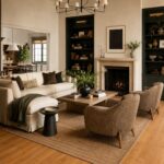

A minimalist living room can start with a tension rod and sheer curtains or grow into a low slatted sideboard that needs its tallest items measured first.
[link-whisper-related-posts]1. Neutral Colour Palette
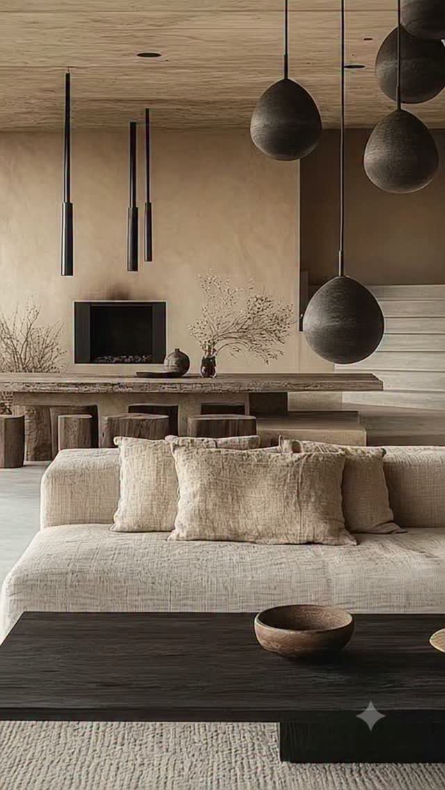
Beige, gray, and black do the heavy lifting in a room that needs to calm down fast. I keep patterns to a minimum because a single busy print on a pillow fights harder than solid pieces working together.
One accent color, used twice at most, keeps the eye from bouncing.
A north-facing room reads colder in gray; I’d warm it with cream or greige instead. South light can handle cooler tones without turning sterile.

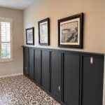
Framed Wall Art: This set of 3 large wall art pieces measures 24 x 36 inches each Finished with black frames with a 1.38-inch frame thickness, the three panels add structure and a clean finished edge around the artwork while creating a refined gallery-style look on the wall

PET-FRIENDLY AND DURABLE: Durable for high-traffic areas, soft and comfortable area rug perfect for families with kids; Low-pile synthetic rug fibers won’t trap dirt and debris, so they’re pet-friendly and easy to clean
2. Quality Furniture
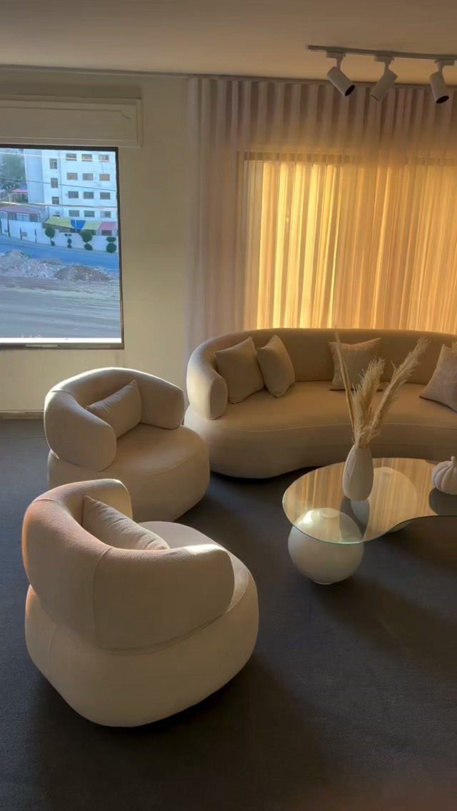
Curved lines on a sofa read softer than boxy frames in a small space, and the rounded chairs keep the conversation from feeling like a waiting room.
Glass tops do what wood cannot: they let light through so the floor plan stays open.
I’d rather own 3 pieces I use daily than 6 that collect dust. The test is whether each seat gets sat in each week; anything that fails for a month is clutter with legs.
Durability matters more in a first home where furniture follows you. A frame with removable cushions buys you years instead of a throwaway cycle.

Comfortable Velvet Upholstery: COLAMY velvet accent chairs feature with soft, high-quality velvet fabric that offers smooth and skin-friendly feel, and add warmth and elegance to your space. Ideal for relaxing after a long day, the small chair for bedroom enhances comfort whether you're reading, watching TV, or simply lounging.

Ideal for Underutilized Nooks: Petite and sculptural, this chic club chair graces guest rooms, reading nooks, or reception areas without cluttering your space. Whether sipping morning coffee or hosting a guest, it offers a reliable seat that feels right at home

360°Swivel Solid Wood Base: Built with a durable solid wood base, this swivel accent chair rotates smoothly in all directions, making it easy to turn and interact without moving the chair. A perfect swivel barrel chair for relaxing, chatting, or multitasking in your space
3. Sheer Curtains
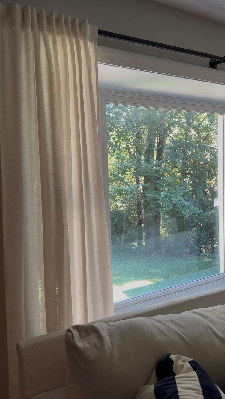
Sheer fabric diffuses light without the flatness of bare windows or the heaviness of drapes.
Blinds behind sheers give you blackout when you want it and filtered light the rest of the day.
I ran this setup in my last rental: landlord’s blinds stayed, my sheers hung on a tension rod, and I took both with me.
A mirror opposite the window doubles what light you have. In the evening, one lamp with a warm bulb beats 3 cool fixtures for making a room feel finished.

Package and Size: Our sheer curtains are packaged in corrugated boxes. The box packaging is more sturdy can better protect the curtains. You can give it as a gift to your family and friends. Each package contains 2 voile curtains. Each curtain measures 42" wide by 84" long. Total width is 84" and total length is 85.5" (including 1.5" header).

Size and Quality: Each pack contains 2 White Sheer Curtains, each 42" width and 84" length. The total width is 84", and total length is 85.5" including 1.5" header. These Light Filtering curtains are suitable for curtain rods with a maximum diameter of 1 inch and offer two hanging options (rod pocket or clip rings)

Ivilon shower curtain rod for bath or windows with heavy duty tension spring and 1-inch diameter rod.
4. Rugs, Cushions, Throws, Plants
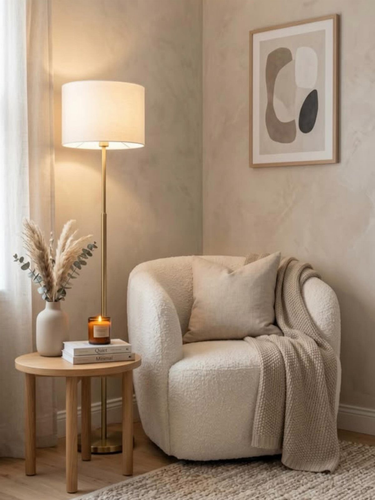
Texture does what color cannot in a neutral room. The bouclé chair, the woven throw, the dried grass: each reads as a variation on the same tone rather than competition for attention.
Natural materials carry the load. Wood warms what metal chills; matte ceramic beats glossy when the goal is quiet.
I limit myself to 2 textures per surface so the eye rests between them.
Plants or dried stems add height where furniture sits low. One tall arrangement on a side table draws the gaze up and makes standard ceilings feel intentional rather than cramped.

Set of 2 Perfect Size Rugs with Decorative Fringes: The pack contains 2 rugs measuring 22 x 34 inches with 3.5-inch fringes on both ends for added texture and visual interest in small spaces like entryways, bedrooms, dorms, bathroom, and nurseries.

CHIC DESIGN: Made from 100% recycled fiber; Average size is 2x3'; These rugs are each unique and handwoven for this reason size and color may vary slightly.Construction type:Hand Made

DURABILITY: Our jute rugs are the perfect solution for any busy family; They are handmade yet their heavy natural fibers make them durable and resistant to slippage; Their rough cross-weave textures mean they're built to last
5. Feature Wall
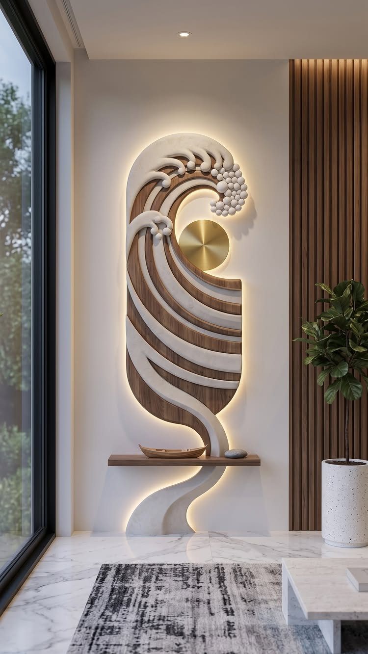
One large piece of wall art outperforms a gallery of small frames in a room that wants to stay clean.
A backlit wave functions as both sculpture and lamp; I’d place it where it replaces a fixture rather than adds to one.
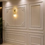
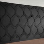
A feature wall in paint or paper works if you stop at one. Two statement walls in the same room fight each other and lose the calm you built.
Vintage furniture as your single interest piece brings history without clutter. An old dresser behind a sofa reads as console, not storage, and the secret compartments stay yours.

[3D Wall Art with Shelf]: This 22x28 inch 3d wall art features a multi-layer, sculptural geometric design. with a built-in shelf, glass vase, and greenery, it adds natural life and modern style to any room, elevating your home decor

[Size & Rooms] 29×58 in panoramic horizontal framed canvas wall art, scaled for wide wall areas in living rooms, bedrooms, hallways, and entryways. Ideal placement includes above a sofa, over a sectional, across a long console, or along extended accent walls. Works especially well in great rooms and open-concept layouts.

Textured Ocean Wall Art: This original hand-painted piece features deep flowing curves that echo the movement of ocean currents, creating a dramatic focal point that pairs beautifully with ocean wall art, coastal home decor, and abstract canvas artwork in modern interiors. Please confirm wall size before ordering to ensure a perfect fit.
6. Enjoy Sneaky Storage
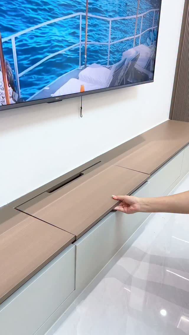
The flip lid on that console hides cables, remotes, and the clutter you need but never want to see.
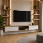
I’d mount the TV at eye level from the sofa and run the console full width underneath; the continuous line tricks the eye into reading the wall as shorter than it is.
Ottomans with storage cost more than open ones but earn it back in a small space where every piece must do 2 jobs. I use one as coffee table, extra seat, and blanket bin depending on the hour.
Free-hanging shelves work when you own the wall; renters should lean toward furniture that moves. A chest beside the sofa holds magazines, board games, and the laptop you promised to put away.

【MODERN ABSTRACT TEXTURED DESIGN】SIZE:20X40in(50x100cm)Featuring layered abstract forms, textured brushwork, and sophisticated neutral tones, this canvas wall art creates a striking focal point that adds depth, dimension, and artistic elegance to any interior space.

【Abstract Brown Grunge Framed Canvas Wall Art Set】This abstract brown grunge framed canvas wall art set features beige, gray and brown. With abstract tree ring elements, exudes the taste of nature, creating an abstract and artistic look. Hanging this set on your wall will bring a sense of peace and tranquility to your home.

MODERN GEOMETRIC COMPOSITION: Sweeping black curves, layered gray forms, warm neutral tones, and fine gold-tone lines create a bold abstract focal point with fluid movement.
7. Low Slatted Sideboard
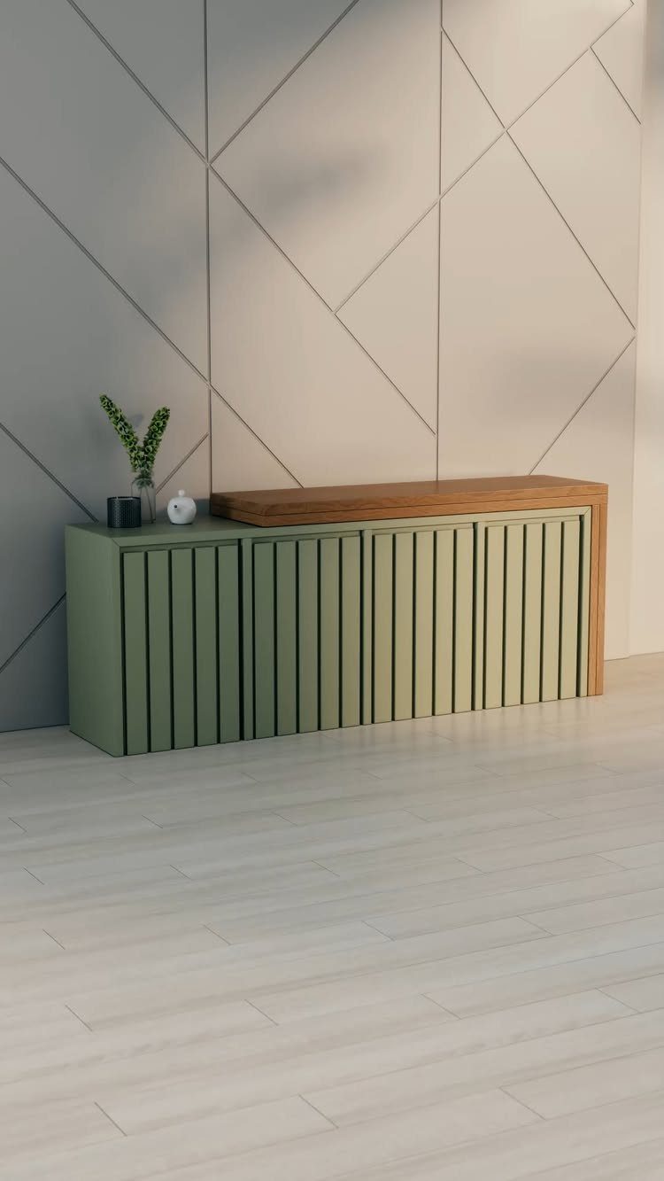
Low slatted sideboards keep the visual weight near the floor, which reads as more open in a small room than a tall cabinet would.
The vertical slats break up a solid block without adding clutter, and they hide whatever you stash behind them better than open shelving would.
A low piece works under a window or beneath wall-mounted art without crowding it. Check that the slats run front-to-back and are spaced tight enough that loose items won’t poke through; pencil-width gaps are typical.
Sage sits well with warm wood floors, but oak or walnut tops also pair with black, white, or navy slats if your room already runs cooler.
I’d pick this for anyone who needs living room storage but finds most credenzas too plain or too bulky. It trades some interior shelf flexibility for that streamlined front, so measure your tallest items first.

360°Smooth Swivel Design: This swivel accent chair features a 360° swivel base, allowing the round swivel chair body to rotate smoothly and effortlessly, so you can enjoy the freedom of easy movement. Whether chatting, watching TV, or reading, you can easily turn to face any direction without moving the chair - the effortless swivel brings comfort and convenience. A great choice for living room, bedroom, nursery, or home theater
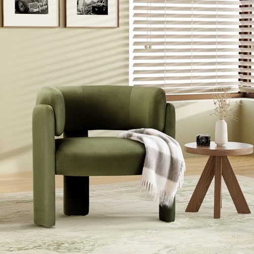
Comfortable Velvet Upholstery: COLAMY velvet accent chairs feature with soft, high-quality velvet fabric that offers smooth and skin-friendly feel, and add warmth and elegance to your space. Ideal for relaxing after a long day, the small chair for bedroom enhances comfort whether you're reading, watching TV, or simply lounging.
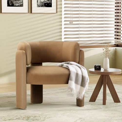
Comfortable Velvet Upholstery: COLAMY velvet accent chairs feature with soft, high-quality velvet fabric that offers smooth and skin-friendly feel, and add warmth and elegance to your space. Ideal for relaxing after a long day, the small chair for bedroom enhances comfort whether you're reading, watching TV, or simply lounging.
8. Open Plan Minimalist Layout
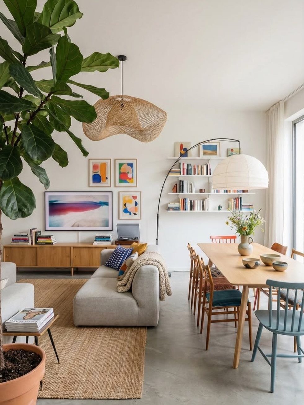
An open plan only reads as minimalist if you edit what sits in view from every angle. Treat the whole connected space as one room: repeat 2 or 3 materials across both zones so the eye travels smoothly.
Light wood of the dining table echoes in floating shelves and a rug’s natural fiber, while a grey sofa ties to the floor and the credenza below.
The layout works best when the living and dining functions each claim a distinct zone without a wall between them. A low credenza or sofa back can mark the boundary; anything taller than chest height starts to defeat the purpose.
The large plant here does the same job as a partial wall would, softening the edge without blocking light.
This suits renters who can’t knock walls down and first-home owners who want the spacious feel without the construction cost. Noise and smell travel freely in open plans, so skip it if someone works from home while another cooks dinner.

Package and fit: Includes 2 Cream sheer curtain panels, each 42 inches wide by 84 inches long, for 84 inches of combined flat width. The 84 inch tier format is suited to kitchen windows over the sink, cafe windows, bathrooms, laundry nooks, basement half windows, and RV windows. Measure the window and rod position before ordering and allow additional width for fuller gathers.

The Kenney Twist & Fit No Tools Spring Tension Shower Curtain Rod is adjustable from 24-38” wide to fit compact, standing, or stall shower

Elegant Vertical Striped Design: OWENIE striped sheer curtains feature a subtle vertical stripe texture that adds a modern, sophisticated touch to any space. The delicate pattern creates a soft, diffused light effect, transforming ordinary sunlight into a beautiful, striped pattern on your floors and walls
Benefits of Minimalist Design
Fewer pieces mean fewer dollars spent on furniture that follows you from rental to rental.
Cleaning takes half the time when surfaces stay clear. A single console with a flip lid takes one pass with a duster; six small tables with cables snaking between them take the whole afternoon.
The environmental benefit shows up in what you skip buying: single-use decor items that crack in a year and head to landfill. A dried grass arrangement lasts longer than seasonal plastics and costs nothing to maintain.
Mental space follows physical space. In my own experience, a room with only what gets used weekly carries less background noise than one filled with just-in-case pieces.
The eye rests, and so does the mind.

Natural Cotton Boho Rug: This beige bohemian rug made from innately soft cotton sturdy polyester and viscose, and has no pungent smell. Without any industrial prints make the cozy and neutral floor mat great for your kids and pets

SUSTAINABLE MATERIALS: Made from a durable blend of natural jute braids and recycled cotton yarns, this beige jute rug is a planet-friendly option. Its boho chic and modern organic design adds conscious style to any home.

HANDWOVEN JUTE RUG: This handcrafted area rug measuring 24 by 36 inches embodies unparalleled quality and attention to detail, as skilled artisans meticulously craft each piece. Made from a natural blend of jute and cotton fibers, this rug offers an eco-friendly choice for your home decor. With its exceptional craftsmanship, eco-conscious materials, and luxurious softness, this rug is the perfect addition to elevate the aesthetic and comfort of your living space.
Avoiding a Boring Minimalist Space
A neutral room dies when every surface reads flat.
I’d place it where the light hits: a single ceramic vessel on the low slatted sideboard, or the spine of one book left visible.
One tall arrangement beats three small ones competing for the same surface.

【3D Wall Art with Handcrafted Sandstone Texture】- This abstract wall art features a double-layer floating structure combining handcrafted sandstone texture with durable solid wood panels. The layered design creates visual depth without a flat printed appearance. Each decorative sphere is carefully hand-attached, while black, white, gray gradient tones and metallic accents add subtle contrast and dimension under changing light, creating a distinctive textured wall art piece

Framed Wall Art: This large framed wall art set includes 3 pieces of boho modern neutral abstract wall paintings, each measuring 20 x 28 inches, with a total display size of 28" H x 60" W. The off-white and brown geometric design creates a clean and stylish focal point for your living room, bedroom, office, or dining room

3D PLASTER RELIEF SCULPTURE DESIGN. This 16x24 inch unframed wall art showcases a serene abstract female figure emerging from a cracked textured plaster wall in a monochromatic warm beige palette, creating a striking 3D relief effect with organic wabi-sabi aesthetics. Blending minimalist neutrality with tactile sculptural charm, it evokes quiet introspection and raw natural beauty, infusing any interior with understated sophistication and calming earthy elegance.
Frequently Asked Questions
What colors work best in a minimalist living room?
Beige, gray, and black do the heavy lifting, with one accent color used twice at most to keep the eye from bouncing.
A north-facing room reads colder in gray, so I’d warm it with cream or greige instead; south light can handle cooler tones without turning sterile.
What is minimalist design?
Minimalism keeps what you actually use and need, then stops adding. The palette stays neutral, the shapes stay simple, and the decoration stays spare.
The style often uses open floor plans, natural light, and highly functional furniture, with texture and occasional color added sparingly for personality.
What are common mistakes in cozy minimalism?
The biggest mistake is treating minimalism as permission to strip everything bare and call it done. A room needs selective texture, one or two interesting elements, and your own personality to avoid reading sterile or boring.
Another misstep is rushing: adding too much too fast breaks the calm you’re building, so take it slow and let each piece earn its place.